Animal Planet
Image Spot
Art & Design
The network's name,
turned into a landscape.
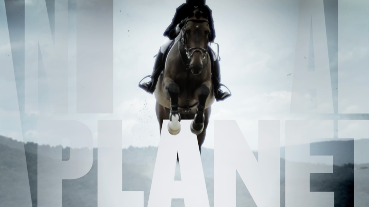
Animal Planet's image spot had one job: make the brand feel cinematic and majestic, not cute. The idea was to build its very name into the world — monumental ANIMAL PLANET typography standing in sky and mountains, with a powerful animal moving through the letters in slow motion. Type as environment; animals as the reason to look up.
Make the type monumental.
As designer for agency Favorite Color, I shaped the look: oversized, architectural letterforms set against sky and terrain, timed so a show-jumping horse clears and threads through them. Everything stays desaturated and wide — quiet colour, huge scale — so the drama comes from the animal and the light, not from noise. The name becomes a place the footage lives inside.
Letters big enough to gallop through.
Sky, horse, and a name in the hills.
In motion it all comes together: the camera lingers on the animal, the giant letters rise out of the landscape, and the whole thing breathes — an image spot that tells you what Animal Planet stands for without a word of voiceover.