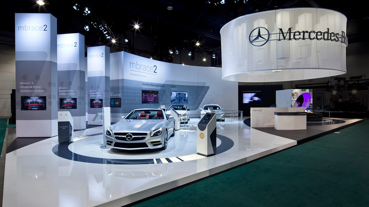
mbrace
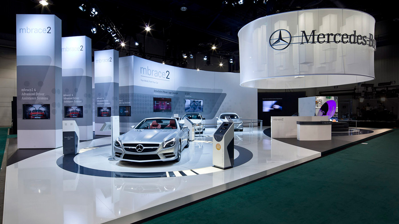
Trade Show Display
UX/UI, Design, Digital & Technology
Brand Foundation
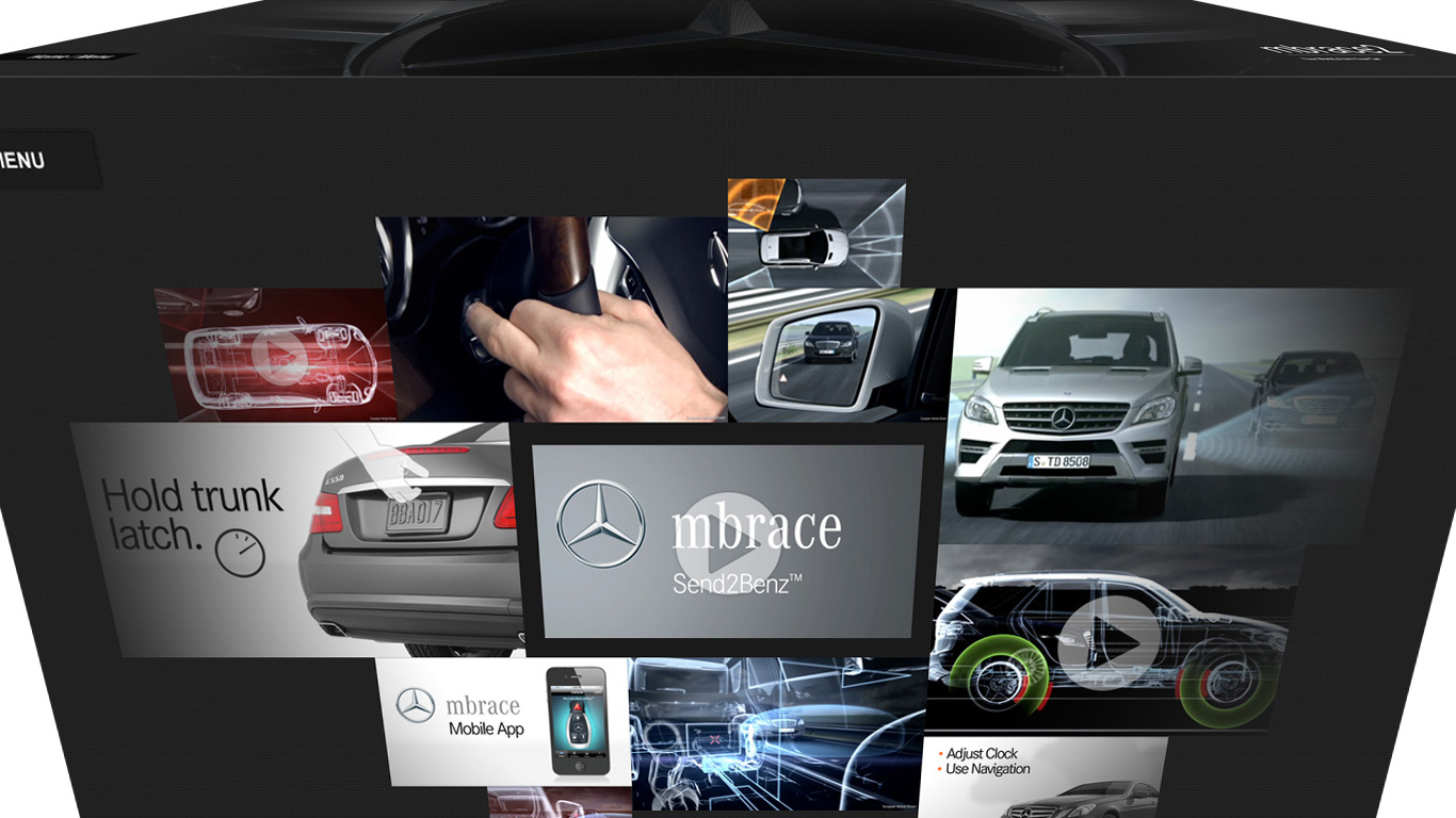
A premium, restrained aesthetic where dark space, engineered light, and generous typography let the product take center stage.
Cinematic Calm
Deep, near-black canvases with soft directional light. Space is a feature, not a void — content emerges from darkness.
Effortless Touch
Every surface responds to the hand. Navigation is physical — swipe, pinch, tap — and always forgiving.
Engineered Detail
Brushed-metal surfaces, precise rules, and typographic hierarchy signal craft and confidence.
Confident, concise, human. Copy speaks in short imperative cues — Touch to Start, Hold trunk latch — never technical or verbose. Reassuring where it matters most: peace of mind.
Logo & Lockup
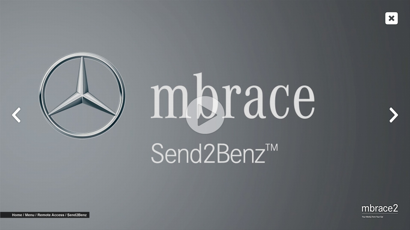
Emblem paired with the wordmark set in a high-contrast serif. Lowercase wordmark, superscript numeral, red tagline rule.
Maintain padding equal to the cap-height of the wordmark on all sides. Never crowd with other elements.
Color System
The palette is 90% neutral — obsidian to platinum — carrying the cinematic mood. Red is reserved for a single point of emphasis per screen: an active state, the tagline rule, or the numeral. Amber appears only within instructional content overlays.
Typography
High-contrast serif for headlines, wordmark, and navigation labels. Elegant, editorial, unmistakably premium. Use weights 400–500.
Bold sans for UI controls, buttons, breadcrumbs, and cues. Often uppercase with letter-spacing. Functional and legible at distance.
UI Components
Semi-transparent dark chips float over imagery. Serif label, generous padding. Active state fills Signature Red.
Persistent, top-left. Bold caps, subtle border, dark fill.
Brushed-metal ring over thumbnails; translucent white when overlaid on video.
Bottom-left, anchored bar. Current node in white, path in grey.
Prev / next chevrons flank fullscreen content; close sits top-right.
Screen Anatomy
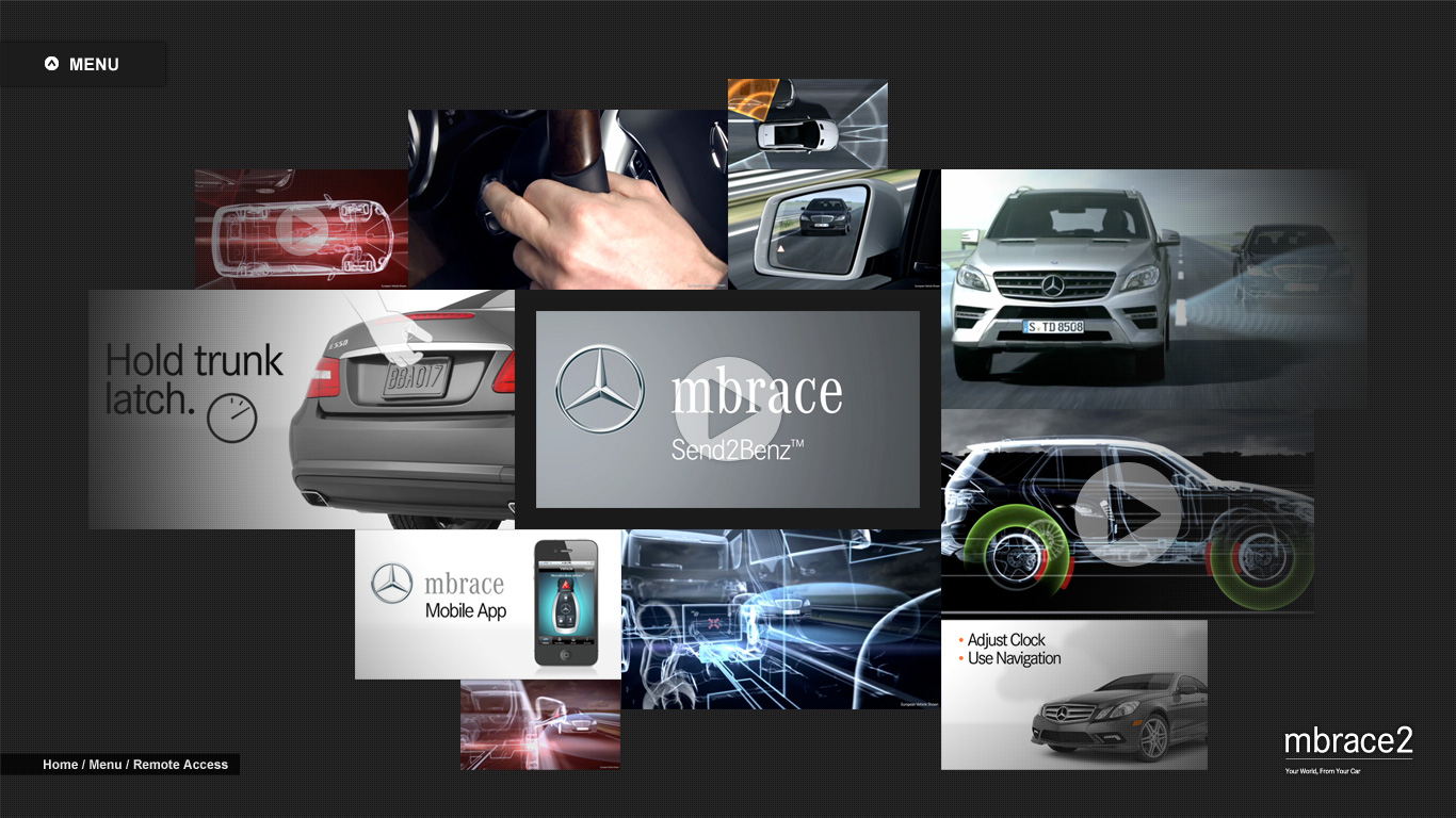
Persistent top-left. Single-step retreat through the hierarchy.
Bottom-left trail; orients the visitor at all times.
Bottom-right lockup, always present, never interactive.
The centered field where imagery, video, and chips live.
Motion & Gesture
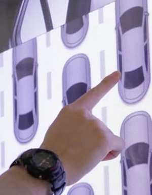
Navigation is a physical language. Motion is smooth, weighted, and reversible — nothing snaps.
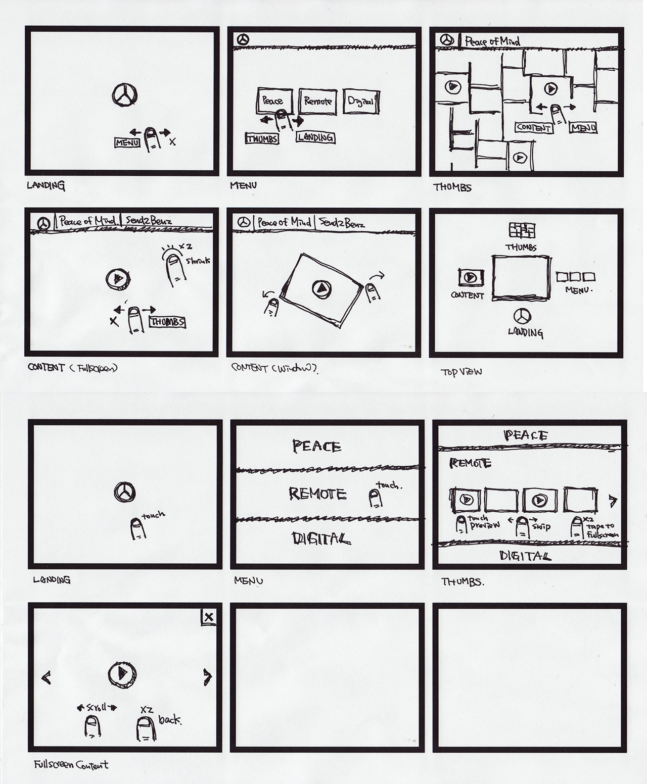
Imagery
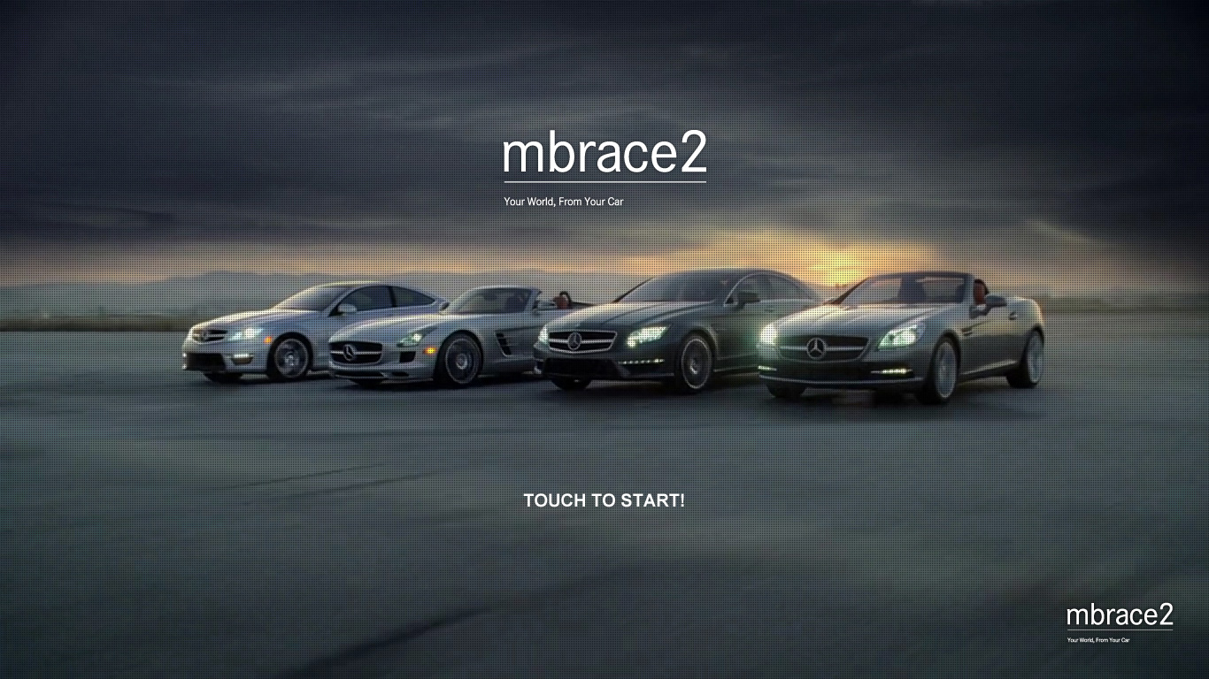
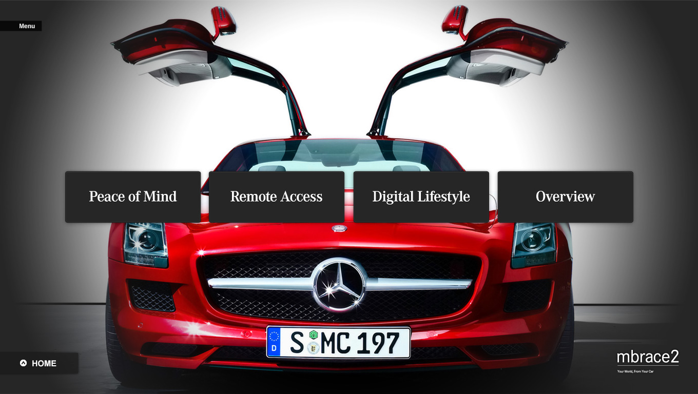
Directional, low-key lighting. Deep shadows, controlled specular highlights on metal and glass.
Let subjects emerge from black. Negative space frames the hero and carries the type.
Flat, evenly-lit stock. Busy backgrounds. Saturated color casts that fight the neutral palette.
Screen Gallery