McDonald's
App
UX/UI, Design & Creative

Crave it.
Order it.
Love it.
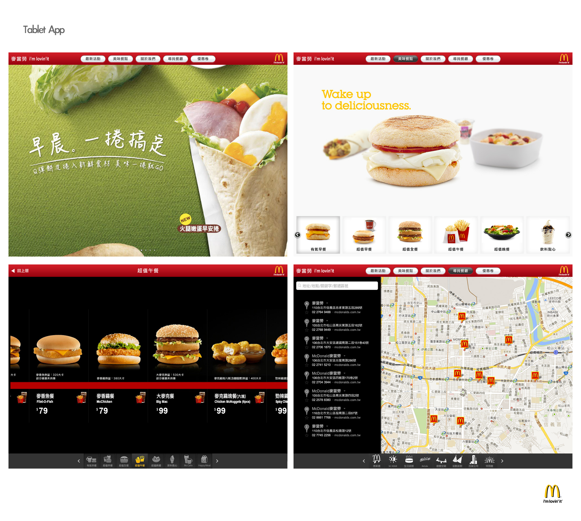
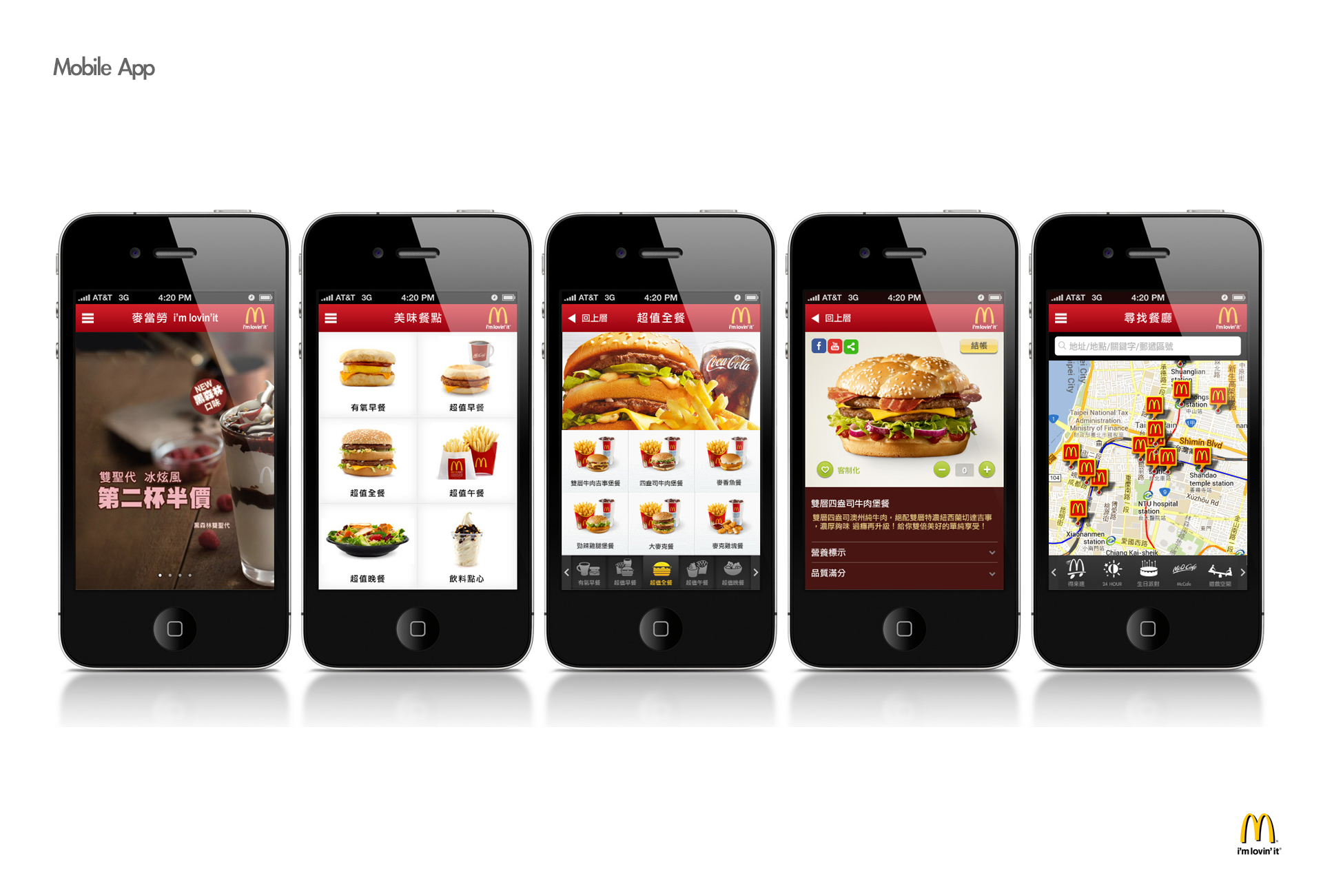
The digital design language for McDonald's — a warm, appetizing, effortlessly fast ordering experience across web, mobile app, and in-store screens.
Brand Foundation
Warm, human, and unmistakably appetizing. The interface gets out of the way so the food and the moment of craving take center stage.
Appetite First
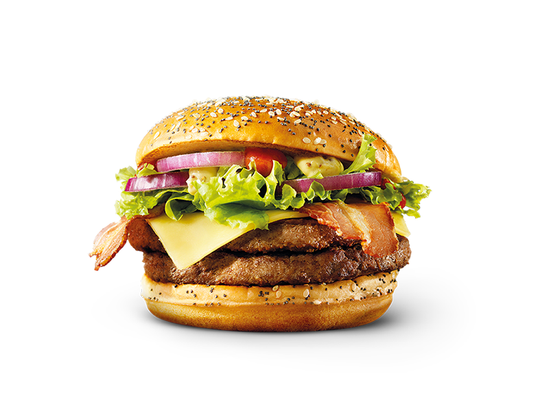
Photography leads. Every screen is built to make the food look irresistible — generous imagery, warm light, minimal chrome.
Effortless Speed
The fastest path from craving to checkout. Big tap targets, clear steps, nothing between the guest and their order.
Familiar Warmth
Rounded forms, warm neutrals, and friendly copy. The product feels welcoming to everyone, on any device.
Cheerful, direct, and generous. Copy invites rather than instructs — Grab yours, Made your way, Ready in minutes. Never salesy, never cold. Short lines, active verbs, a smile in every headline.
Logo & App Icon
The Golden Arches lead the lockup, paired with the wordmark set in Bricolage Grotesque, Extra Bold. The Arches carry the brand alone at small sizes and in the app icon.
Keep clear space equal to the height of the mark on all sides. Never stretch, recolor outside the palette, or add effects.
Color System
The system is built on warm neutrals — cream through clay — that make food photography glow. Ember drives every primary action; Golden is reserved for deals, savings, and celebratory moments. Fresh green signals confirmation and fresh ingredients only.
Typography
Characterful grotesque for headlines, wordmark, prices, and section titles. Weights 700–800, tight tracking. Confident and appetizing.
Clean, highly legible sans for body copy, menu items, labels, and controls. Weights 400–700. Reads clearly at small sizes on any screen.
UI Components
Fully rounded pills. Ember for the single primary action, Ink for secondary, outline for tertiary. Minimum 44px tap height.
Square tiles, rounded corners. Active category fills Ink. Used across menu home on web and app.
Circular quantity stepper; pill badges for dietary and promo tags.
Floating Ink tab bar with Ember active state. Pill search field sits at the top of menu screens.
Screen Anatomy
Every screen follows one rhythm: identity up top, a craving-driven promo, browsable content, and a persistent path to the bag.
Motion & Interaction
Motion is warm and bouncy — a little spring on tap, quick and satisfying. Nothing lags between craving and confirmation.
Food Photography
Warm, natural light. Fresh ingredients, visible texture, steam and gloss that read as delicious.
Fill the frame. Shoot close and slightly overhead; let food be the hero on cream or clean white.
Cold blue light, cluttered tables, heavy filters, or cool color casts that fight the warm palette.
Screen Gallery