Breztri
Omnichannel
UX/UI, Design & Creative
A warm, human take on a clinical category — gold optimism, teal calm, and a signature breath motif.
BREZTRI treats a serious condition, yet the system leans deliberately hopeful. Saturated gold carries energy and the headline stat moments; teal supplies clinical trust and quiet accents; generous cream and mint tints keep long, compliance-heavy pages breathable. Everything orbits a single idea — the AEROSPHERE — expressed as a spun swirl and a geodesic sphere.
For patients
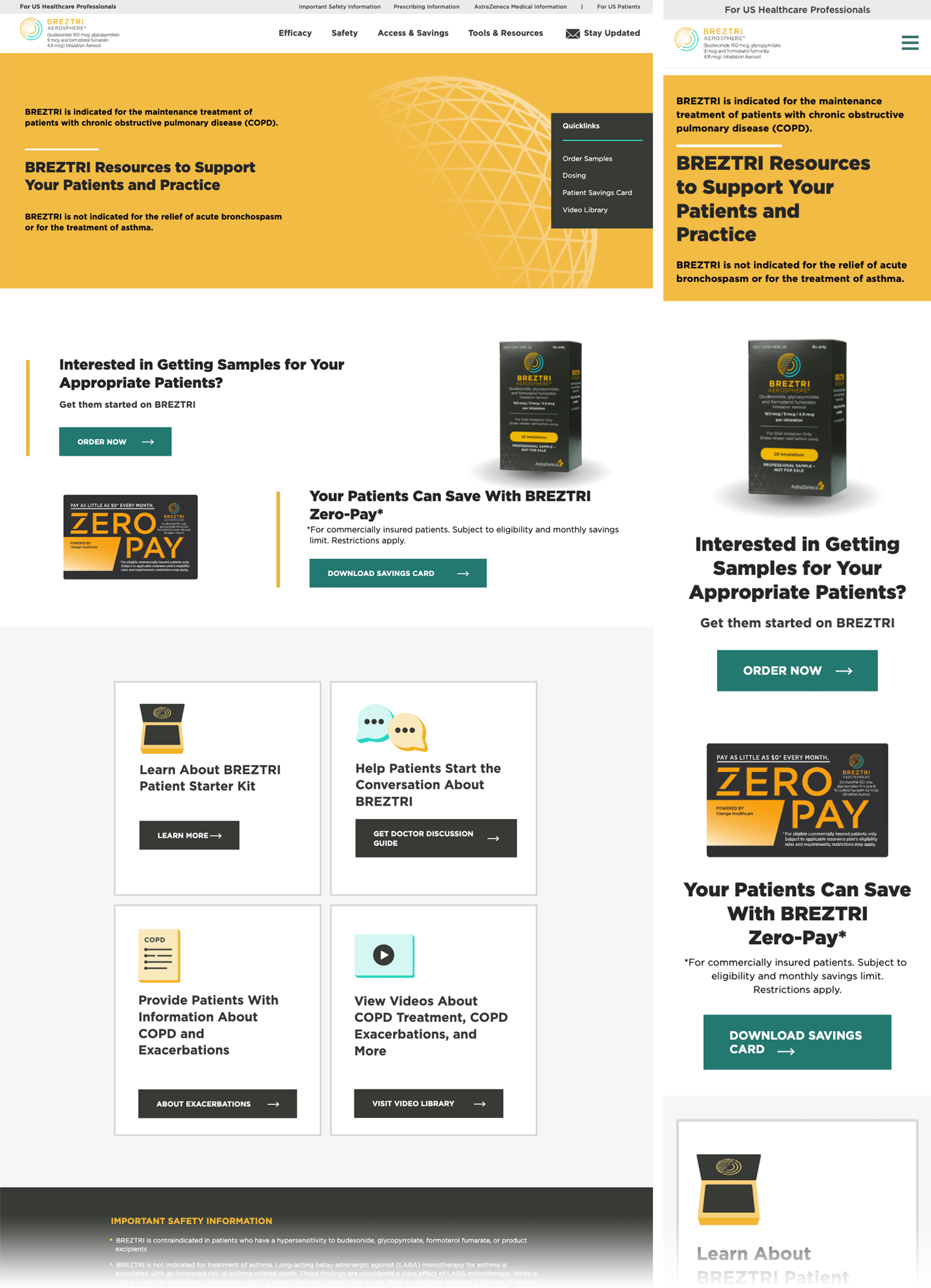
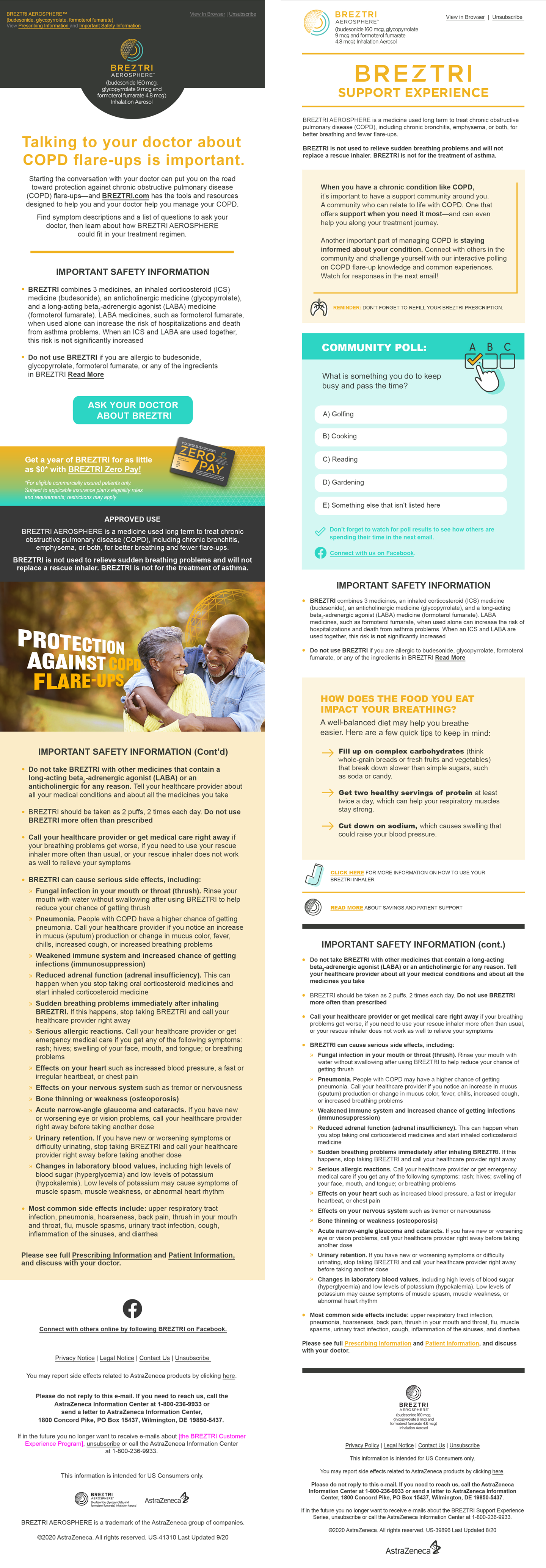
Warmer and more playful — pill buttons, illustrated main-street scenes, cream/mint alternating bands, big friendly stats. Plain-spoken, encouraging voice.
For healthcare pros
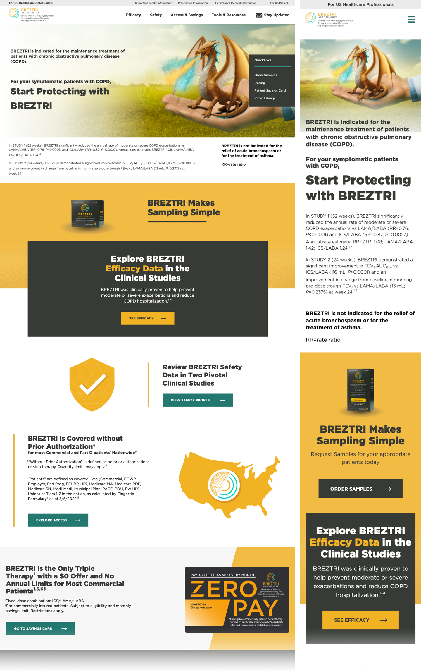
Denser and more clinical — square-cornered buttons with arrows, gold hero fields, data-forward copy with citations. Same palette and motifs, sharper delivery.
The wordmark & brand mark

- Mark — concentric teal-to-gold arcs sweeping into a spiral: a stylized breath / vortex, with a soft radial-gradient core.
- Wordmark — “BREZTRI” in heavy gold caps, widely letterspaced.
- Descriptor — “AEROSPHERE®” plus the molecule / dosage microcopy, set beneath.
- Master shown is the reversed lockup (white descriptor) for dark surfaces & photography.
Keep clear space of at least the mark’s radius on all sides.
Note: the supplied master carries a white descriptor for dark use. On light backgrounds, use the dark-descriptor variant of the lockup (wordmark shown above for reference).
- Preserve the teal→gold arc order in the mark.
- Keep the AEROSPHERE® descriptor + dosage microcopy in regulated contexts.
- Use the reversed master on ink or photography.
- Recolor the mark or flatten it to one hue.
- Condense or tighten the wordmark’s letterspacing.
- Place the white-descriptor master on low-contrast gold.
The palette
Hex values below were pixel-sampled from the live pages and normalized into a working palette.
One humanist sans, worked hard
The source uses a single geometric-humanist sans across weights — friendly, high-legibility, heavy at display sizes. Shown here in Mulish as an open-source stand-in; IBM Plex Mono handles labels & data annotations.
900 · 64/62 · -2%
800 · 44/46 · -2%
800 · 30/34
700 · 20/26
600 · 20/30
400 · 17/28
400 · 13/20
500 · 12 · +2px
Everything orbits the AEROSPHERE
Two graphic devices carry the brand — a spun breath swirl and a golden geodesic sphere. They appear as logo, texture, spot illustration and full-bleed hero art.
Components
Gold pill · 100px radius · 800
Teal square · 0 radius · caps
Gold square · caps
Ink square · gold arrow
BREZTRI combines 3 medicines. LABA medicines, when used alone, can increase the risk of hospitalizations and death from asthma problems. When an ICS and LABA are used together, this risk is not significantly increased.
Do not use BREZTRI if you are allergic to budesonide, glycopyrrolate, formoterol fumarate, or any of the ingredients in BREZTRI.
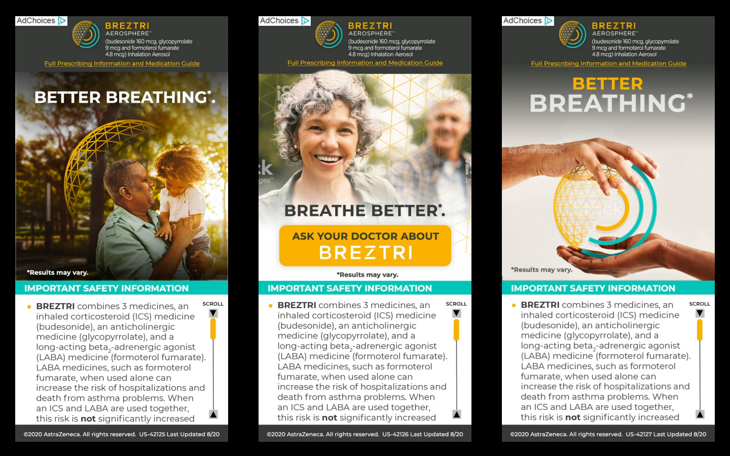
Warm, natural, hopeful
Real, active-life patients in golden-hour light; a warm color grade that ties photography to the gold palette. Product and CGI (the sphere, the dragon efficacy metaphor) sit on airy outdoor backdrops. Mobile-first crops are considered — heroes reflow cleanly to portrait.

- Natural light, candid moments, active seniors.
- Warm grade that harmonizes with gold.
- Let the swirl/sphere interact with hands & environment.
- Cold, clinical stock or hospital settings.
- Heavy blue color casts that fight the palette.
- Somber or fearful framing of the condition.
Banded, full-bleed, rhythm by color
Pages are built as stacked full-bleed bands that alternate white → cream → mint → dark, with content held to a centered column. A persistent utility bar sits above the header; the ISI anchors the bottom of every page.
Centered, ~1080–1180px max; bands go edge-to-edge, content stays contained.
12-col desktop; cards resolve to 2-up and stack to 1-up on mobile.
DTC leans soft/pill; HCP leans square. Cards ~6–8px.
Hero headlines scale up relatively; nav collapses to “Menu”; bands preserved.
How it speaks
Names a serious condition plainly, then pivots to control and hope.
Short, verb-led lines: “Ask your doctor,” “Start protecting.”
Precise, cited, data-forward for professionals — same warmth, sharper claims.
Safety, eligibility and legal are never buried — the ISI is a first-class citizen.
- “Ask your doctor about BREZTRI.”
- “You could be eligible to pay as little as $0.”
- “Proven to reduce COPD flare-ups.”
- Fear-based or absolute “cure” language.
- Dense jargon in patient-facing copy.
- Claims without the accompanying citation / ISI.
Screens in production
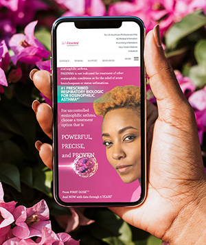
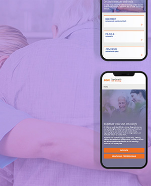
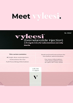
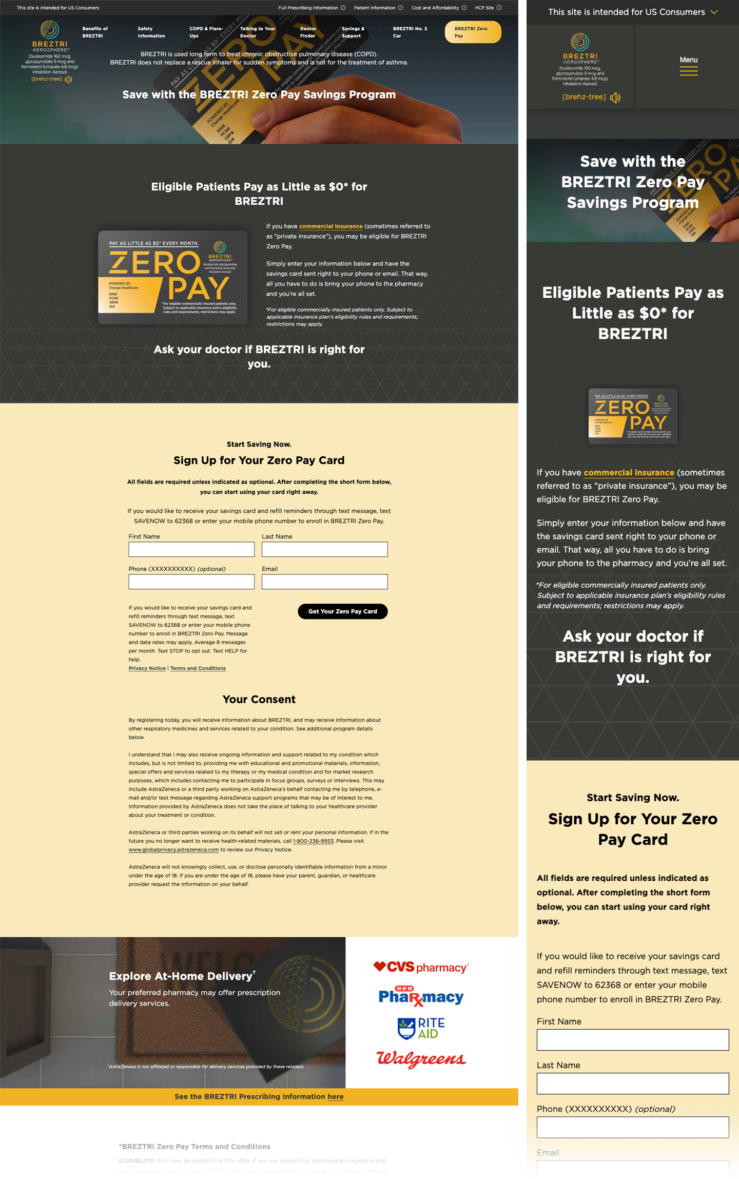
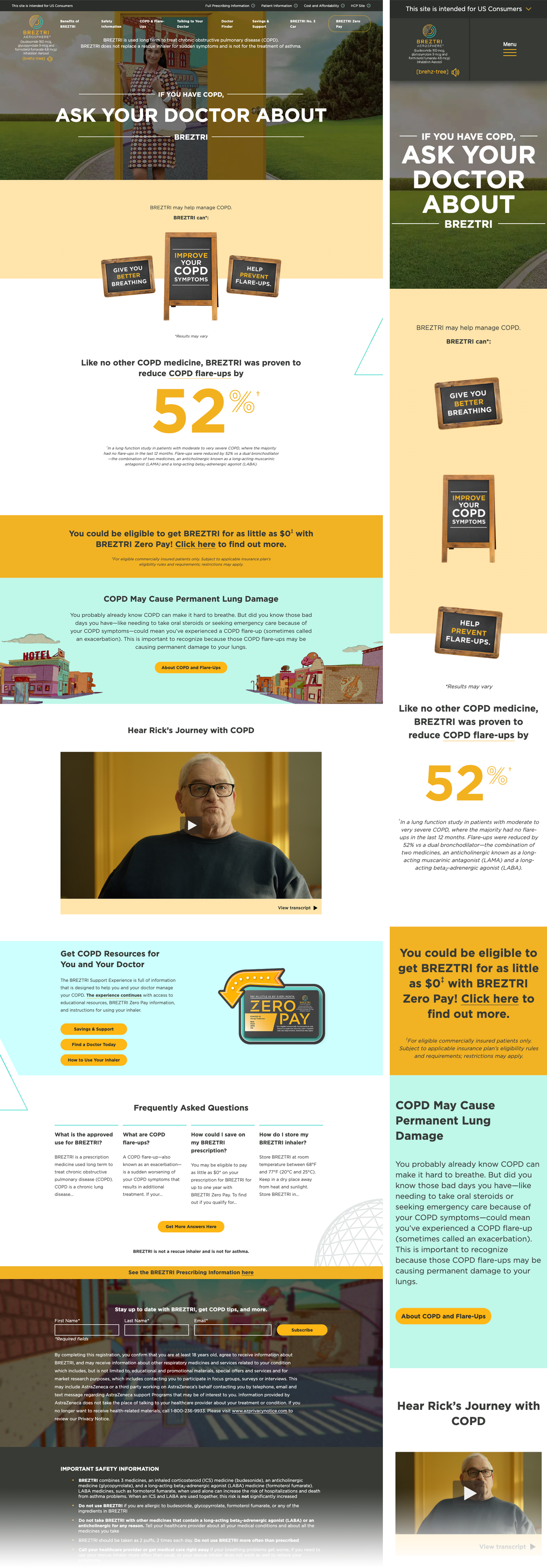
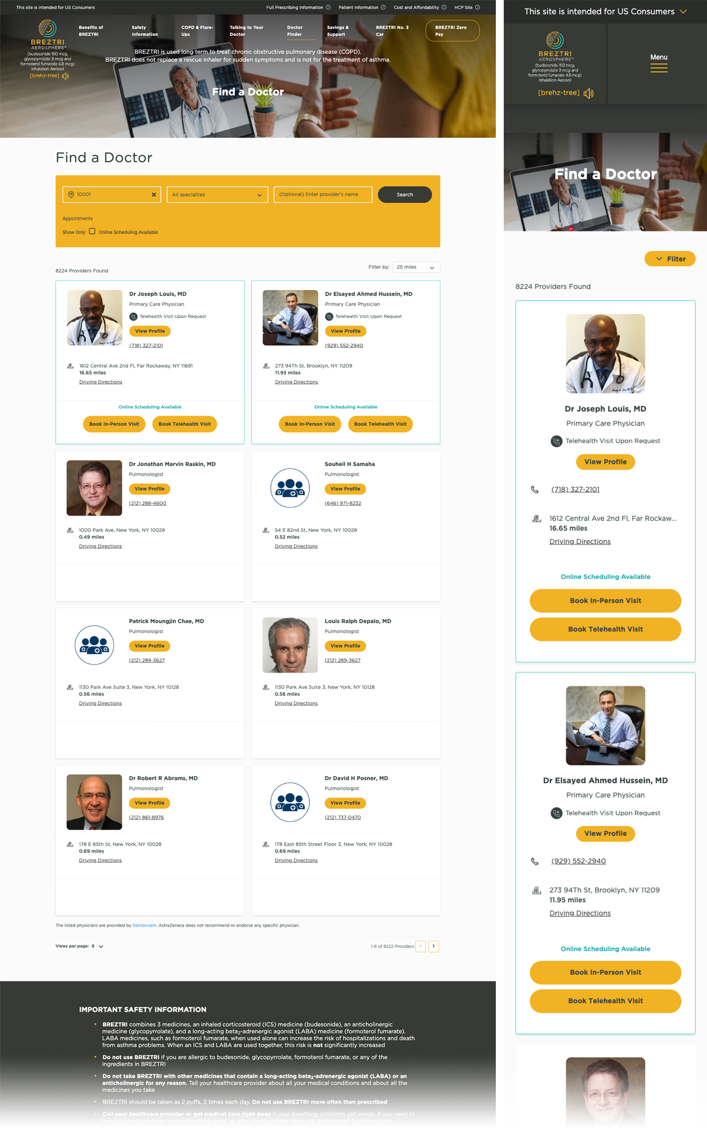
The system applied across the omnichannel program — consumer (DTC) and healthcare-professional (HCP) web, CRM email and display advertising.