Fasenra HCP
Website
UX/UI, Design & Creative
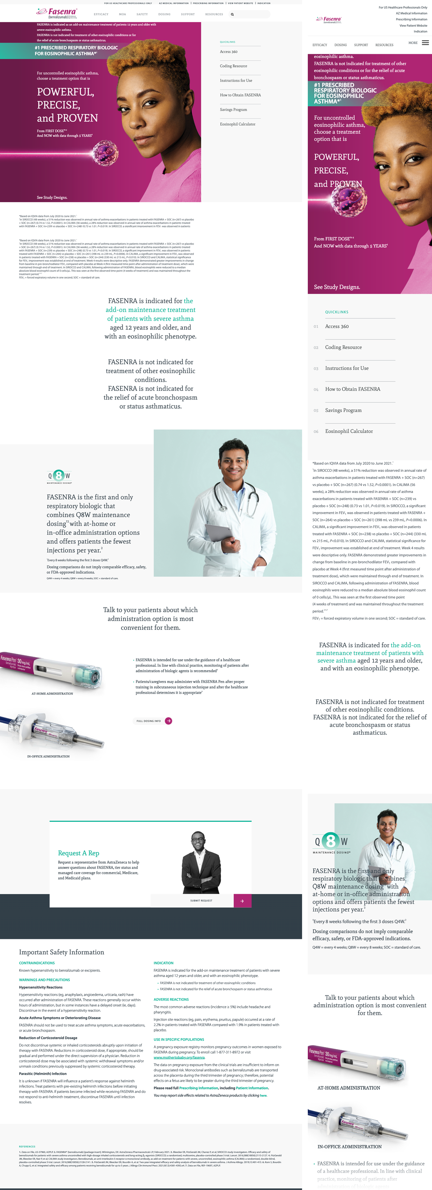
Clinical confidence, told with warmth and clarity.
The system pairs an editorial serif voice with a precise, functional sans. Deep magenta carries brand equity and action; a vivid teal signals data, proof and progress; a calm slate grounds dense clinical information.
Generous whitespace, two-column editorial rhythm, and human-centered photography keep a heavily regulated category feeling premium, credible and human.
The signature mark
A magenta wordmark with a hand-drawn ellipse and teal accent, locked to the molecule name. The two brand colors already live inside the mark.

Keep clear space of at least the cap-height of the wordmark on all sides. Scale proportionally and preserve the ellipse and teal dot.
Don't recolor, stretch, add effects, rotate, or place the mark on a busy background that reduces legibility.
A palette built for proof
Two owned brand colors, a grounding neutral family, and a magenta gradient reserved for signature moments.
Use magenta for a single primary action per view. Use teal for data highlights, numbered indexes, links and section rules. Keep 90%+ of surface neutral.
Don't place magenta and teal at equal weight, tint the gradient behind text, or introduce off-brand hues. Never set long copy in magenta.
Editorial serif, functional sans
A high-contrast serif carries voice and headlines; a neutral grotesque handles navigation, labels, UI and dense regulatory text. Monospace annotates data.
92 / 300
44 / 300
28 / 400
18 / 400
14 / 400
12 / 600
A small, disciplined kit
Every interactive surface draws from the same handful of patterns — pill CTAs, teal-ruled cards, numbered editorial lists and oversized pull quotes.
Primary = white pill + magenta arrow circle · Solid = magenta block, square corners · Tertiary = teal outline pill. Labels always uppercase, letter-spaced.
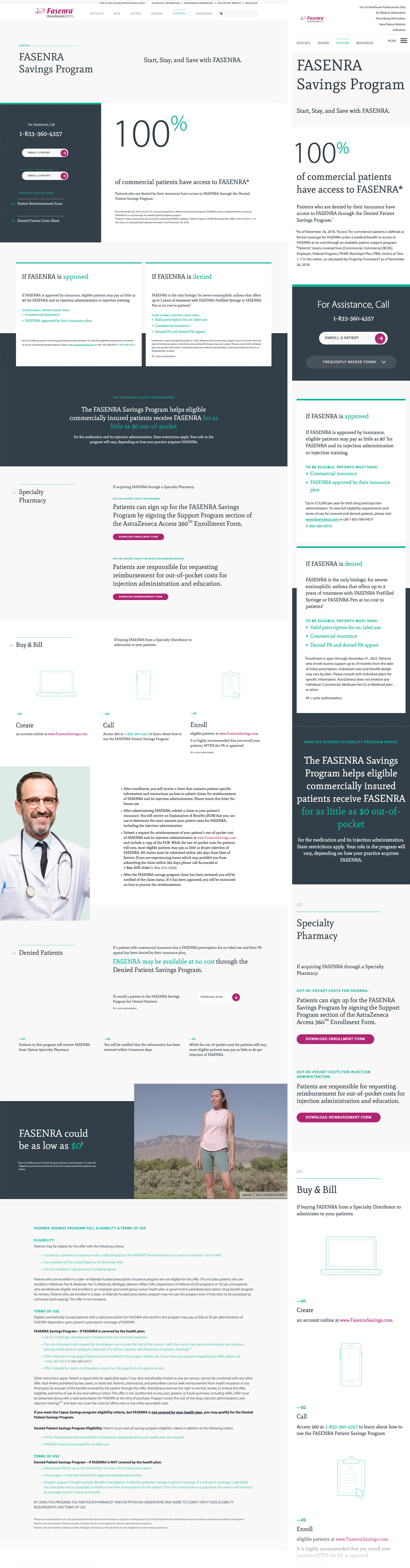
Eligible patients may pay as little as $0. Card headers carry a 3px teal top rule; a keyword is set in teal within the serif.
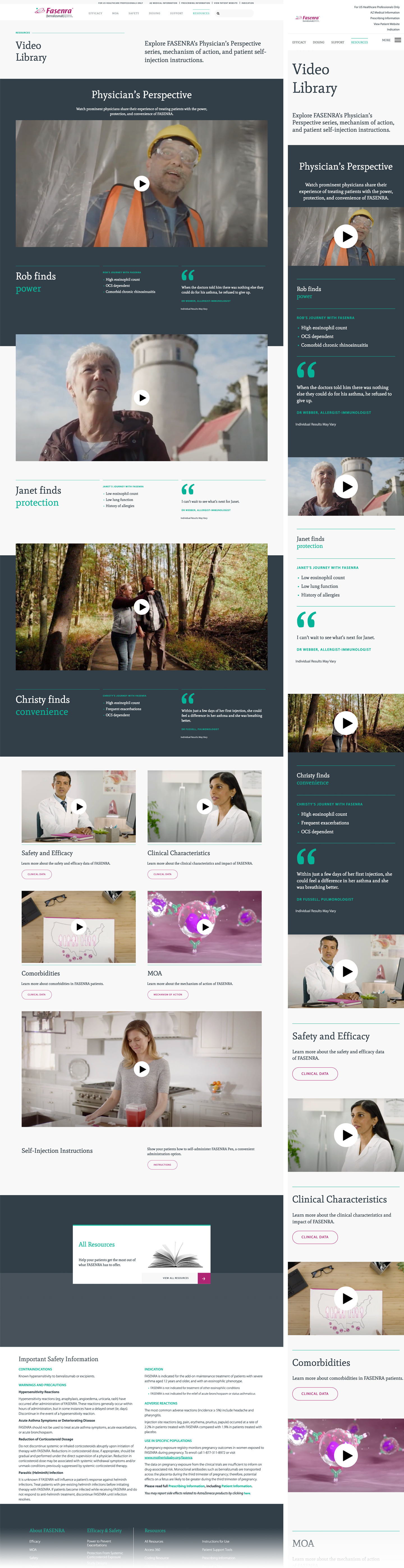
Within days of her first injection she could feel a difference.
Proof, made vivid
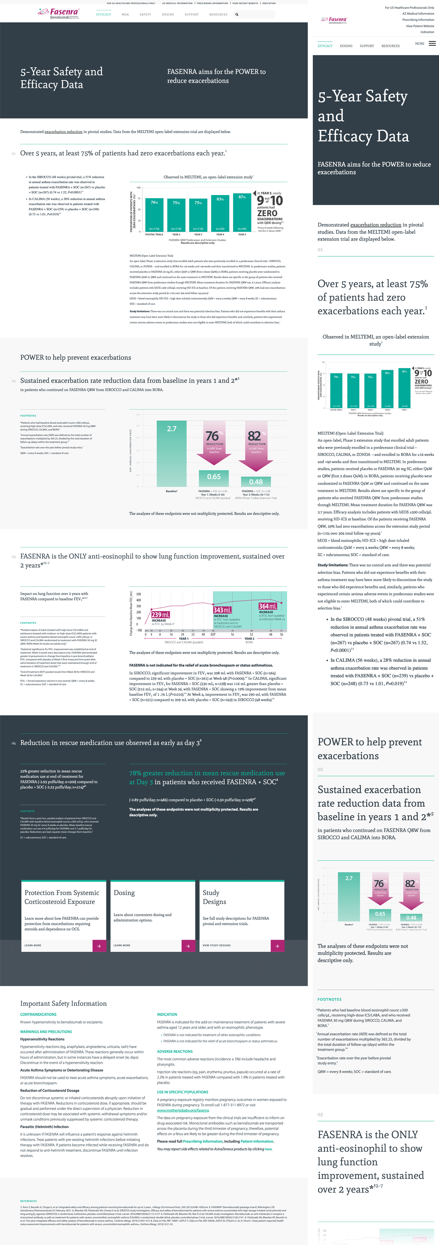
Teal columns show sustained results; magenta gradient arrows dramatize reductions with oversized percentage callouts.
Reduction arrows use the magenta gradient and point downward to the improved value. The percentage is the hero; supporting numbers sit in teal.
Human, luminous, real
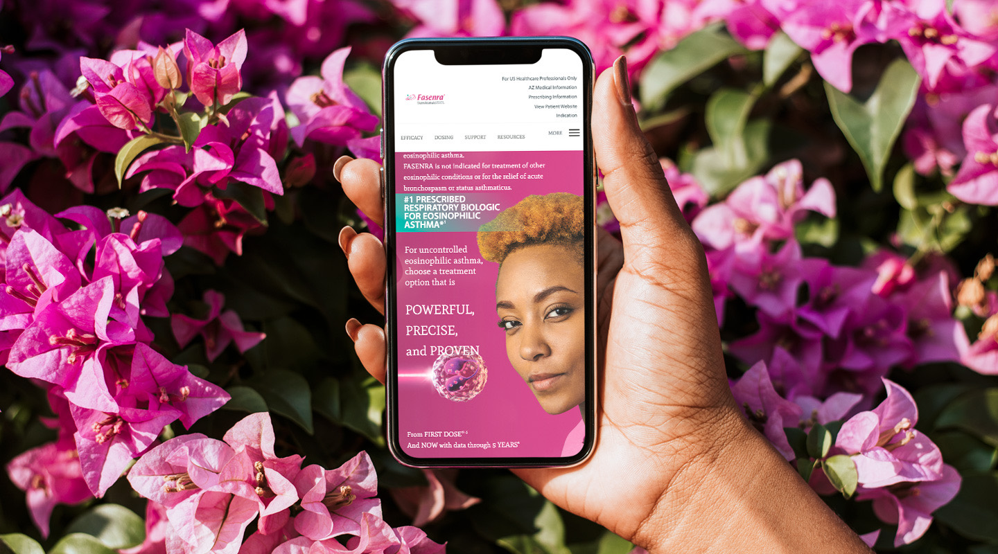
Natural light, genuine expression, and the brand's magenta echoed in real-world color — never clinical or sterile. Faces meet the viewer with quiet confidence.
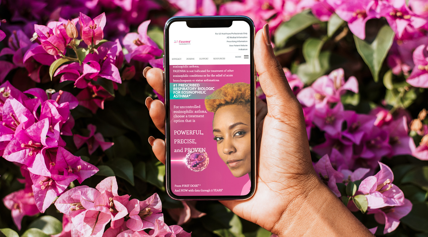
Cast real people, shoot in authentic environments, and let magenta appear naturally through wardrobe or setting.
Avoid cold studio lighting, generic stock, heavy filters, or clinical/sterile settings that undercut warmth.
Two columns, generous air
A recurring label-left / content-right editorial split, numbered sections, and full-bleed color bands that alternate with white to pace long, dense pages.
The system in production
The brand system applied across the Fasenra HCP web experience — homepage, efficacy data, savings and the video hub.