GSK Oncology on Demand
All works
Healthcare

GSK Oncology on Demand

Website

UX/UI, Design & Creative

ClientGSK
Advertising Agencyimre
RoleUX/Technology Director
DisciplineHealthcareUX/UI
GSK Web & digital identity

Oncology On Demand

Digital Brand Style Guide

A working reference for the web & digital identity — colors, type, buttons, forms, cards and photography — for the HCP experience.

AudienceUS Healthcare Professionals
PlatformWeb & Digital
Master brandWarm orange gradient
Versionv1.0
01

Color

The system is anchored by a single warm orange-to-gold gradient used for hero fields and brand moments. Solid Brand Orange drives every call-to-action and headline. Product experiences layer one accent hue on top of the neutral base — never more than one at a time.

Master brand gradient
#F04E23 #F7871F #FDBA2D
CSS · linear-gradient(105deg, #F04E23 0%, #F7871F 50%, #FDBA2D 100%) — angle 100–115° left-to-right.
Core palette
Brand Orange
#F15A29 · CTA / headings
GSK Orange
#F36633 · logo
Ink
#231F20 · display text
Body Grey
#58595B · paragraphs
Surface
#F2EFEA · section bg
Line
#D9D6D0 · borders
White
#FFFFFF · cards / page
Product accent framework

Each product owns exactly one accent, paired with the shared neutral base and orange CTA. Use the accent for that product's hero bands, tile treatments and highlights — never mix two product accents on one screen.

Zejula · Blue
#00A9E0 #005CB9
BLENREP · Green
#8DC63F #333333
Master · Orange
#F04E23 #FDBA2D
02

Typography

A three-voice system: a bold condensed grotesque for headlines (uppercase, tight leading), a transitional serif reserved for the "On Demand" brand lockup, and a humanist sans for all body copy and UI.

Display / Headlines
Aa Bb Cc
Oswald · 600–700
Condensed grotesque for display headlines.
Brand accent serif
Aa Bb Cc
PT Serif · 400
Used only for the "On Demand" descriptor.
Body / UI
Aa Bb Cc
Source Sans 3 · 400/600/700
Humanist sans for paragraphs, labels and forms.
Type scale
H1 · Oswald 700
48/44 · +1% · UPPER
Get an inside look
H2 · Oswald 700
30/32 · UPPER · orange
Once-daily Zejula
H3 · Source Sans 700
20/26
Together with GSK Oncology
Body · Source Sans 400
16/26
Browse our collection of videos to learn how it may help appropriate patients and support informed treatment decisions.
Legal · Source Sans 400
12/18
Reference: 1. ZEJULA (niraparib). Prescribing Information. ©2021 GSK or licensor. This site is intended for US healthcare professionals only.
03

Buttons & CTAs

CTAs are unmistakable: solid Brand Orange, uppercase Oswald label, subtle rounding, and a leading icon. On dark or photographic fields the same button holds; a lighter chip appears over gradient hero bands.

Primary Visit the site #F15A29 · radius 6 · hover −8% L
On dark Sign up White fill on dark / video fields
Secondary Contact us Outline · 2px Brand Orange
Text link Learn more about how it works › Inline · gold underline
Watch video The Watch video pill sits at the base of every video tile — black, full-round, play glyph + uppercase label.
04

Forms & Inputs

Registration forms are single-column, generously spaced, with a full-width orange submit. Fields are outlined rectangles with in-field labels; required state uses an asterisk, italics set the "all fields required" note.

All fields are required.
First Name *
Email *
State
Field specs
  • Height: 46px · padding 13/14
  • Border: 1px #C9C6C0 · radius 6
  • Focus: 2px #F15A29 ring
  • Label: in-field placeholder, asterisk for required
  • Checkbox: 20px, 1.5px orange stroke
  • Submit: full-width Brand Orange, Oswald 600
  • Column: single, 12–16px vertical gap
05

Cards & Video Tiles

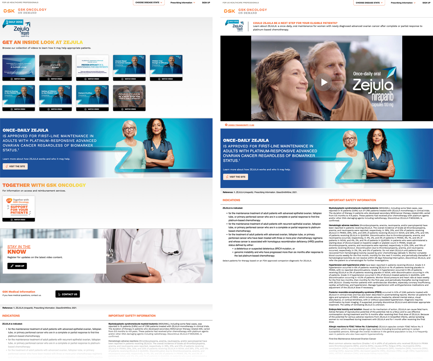
The library is built from a repeating 16:9 video tile: thumbnail image, a black caption bar with the Watch video pill, and square corners in a tight grid. Content bands and promo cards reuse the same square-cornered rhythm.

A Closer Look
Watch video
Anna's Story
Watch video
Proven Efficacy in HR Maintenance
Watch video
Mechanism of Action
Watch video
Anatomy
  • 16:10 thumbnail, square corners
  • Black caption bar, ~36px
  • Play glyph + uppercase label
  • Grid: 4–5 up desktop, 1 up mobile
Hero band
Full-width product-accent gradient with reversed white headline, supporting copy, and one CTA. A brand "swoosh" mark and cut-out photography anchor the right edge.
Promo card
White card over a photographic band, orange overline + bold headline, single CTA. Used for "Stay in the know" and support modules.
06

Imagery & Photography

Warm, optimistic, real. Photography favors natural light, authentic patient and HCP moments, and shallow depth of field. Subjects are often knocked out and floated over the accent gradient. The looping-line "doodle" motif adds texture to flat brand fields.
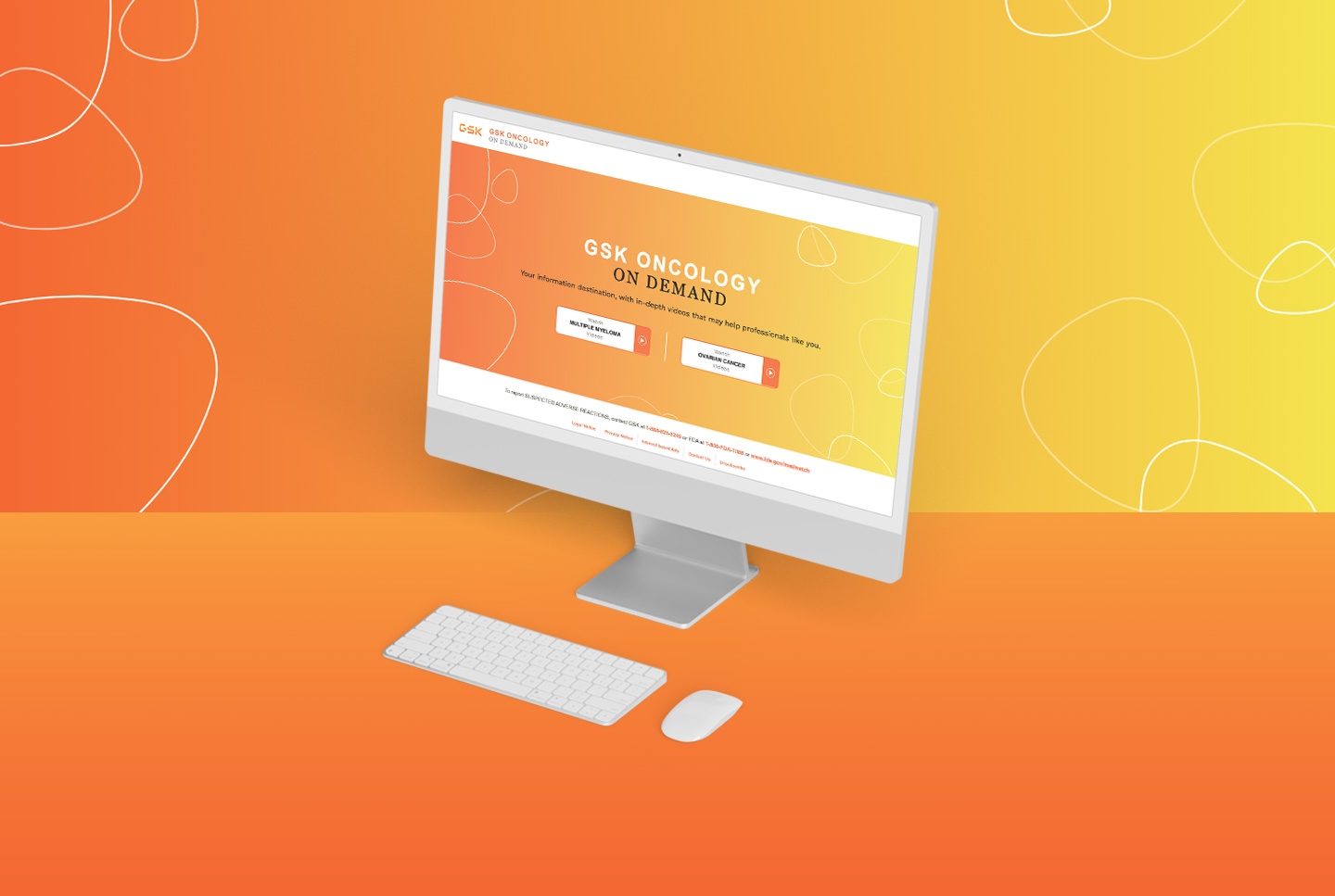
Brand gradient with line motif
Brand field. Orange→gold gradient + white looping-line motif at ~16% opacity.
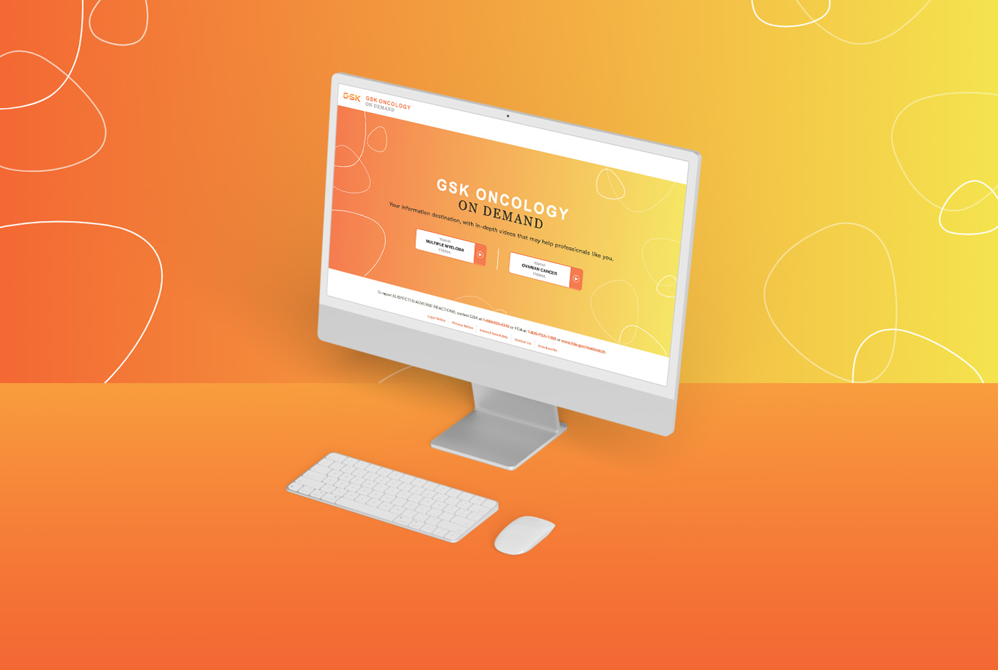
Desktop mockup
In context. Homepage centered on the gradient with dual entry CTAs.
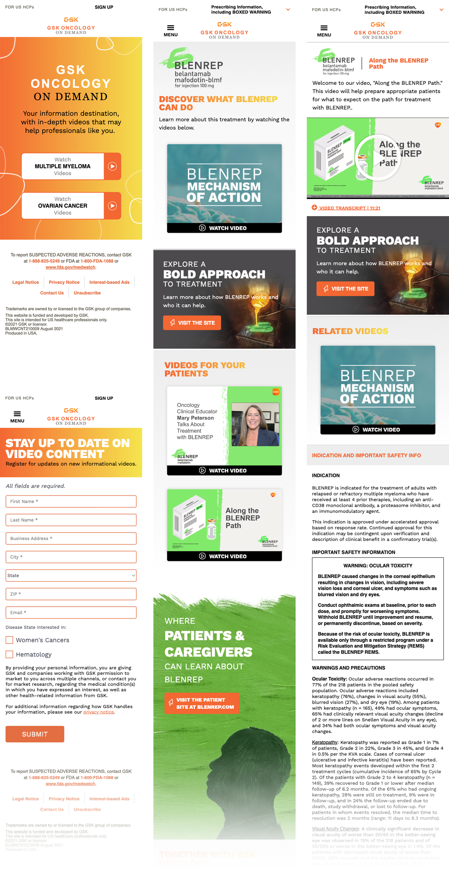
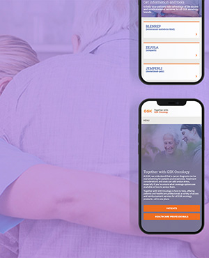
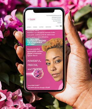
Mobile mockup
Responsive. Single-column stack; hero, tiles and forms reflow full-width.
Do
  • Use warm, natural-light patient & HCP moments
  • Knock subjects out and float on the accent gradient
  • Keep one product accent per screen
  • Reserve the serif for the "On Demand" lockup
Don't
  • Mix two product accents in one layout
  • Set headlines in the body sans or lowercase
  • Use cold, clinical or heavily filtered stock
  • Round the video-tile corners heavily
07

Design Screens

The system in production — the Oncology On Demand HCP experience across desktop and mobile, with the gradient hero, video-tile library and single-column registration.

GSK Oncology On Demand — desktop
Desktop
GSK Oncology On Demand — mobile
Mobile