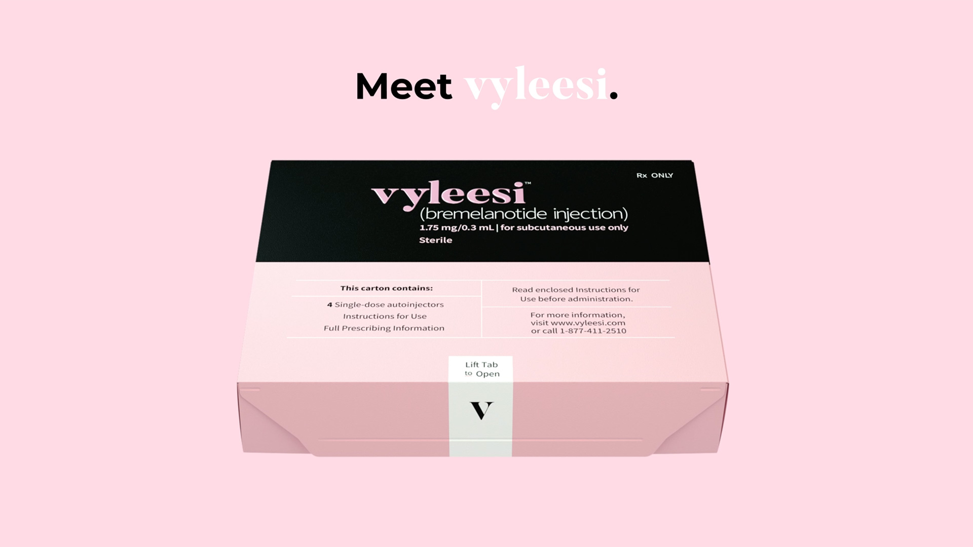
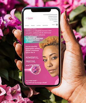
This guide defines how the brand shows up across web and digital — across two deliberately distinct systems: an unbranded disease-awareness voice (Unblush) — dark, electric, playful — and a branded product voice (Vyleesi) — soft, editorial, feminine. Different looks; one female-forward point of view.
Branded — Vyleesi
Unbranded — Unblush
01 — Brand architecture
Two voices, one family
Regulated pharma runs two campaigns in parallel. The unbranded work opens the conversation about the condition; the branded work introduces the product. Both should feel like they come from the same considered, female-forward point of view.
Unbranded
unblush
Disease awareness. Dark, electric, playful — it names the feeling with wit and warmth, never the drug.
unblush.com
Symptom checker
Doctor discussion guide
Conversational CRM
Branded · Now Available
vyleesi
Product. Soft, editorial, feminine — confident and decorative, always paired with required safety information.
Website & symptom checker
Doctor discussion guide
Display, social & multichannel
Email CRM & Vyleesi Kit
02 — Logo & lockups
Wordmarks
Two lowercase wordmarks. Vyleesi is a high-contrast serif with a "V" monogram; Unblush is a bold geometric sans that lives on charcoal. Drop final production logo art into these lockups — clear space, minimum sizes and misuse rules below still apply.
unblush
Bold geometric sans · teal accent · on charcoal
V
vyleesi
[ bremelanotide injection ]
Clear space & minimum size
vyleesi
Clear space = cap-height of the wordmark on all sides.
Minimum digital width: 96px.
Don't
✕ Stretch, condense or re-weight the wordmark
✕ Add drop shadows, outlines or gradients
✕ Recolor outside the approved palette
✕ Place branded mark on low-contrast imagery without a scrim
03 — Color
Two palettes, opposite energy
The two systems don't share a look — they share intent. Unblush is dark and electric: charcoal grounded by a jolt of teal. Vyleesi is soft and editorial: blush and cream anchored by black, with sage and rose as accents.
Branded — Vyleesi
Blush
#F4D4D4
Primary surface
Black
#141414
Text / UI
Sage
#B8D4C8
Accent
Rose
#E4A9A6
Tint / hover
Cream
#F3EFEA
Background
Unbranded — Unblush
Teal
#2EE0C6
Primary accent
Charcoal
#14141F
Base / bg
Grape
#5C4B9A
Secondary
Ink
#0E0E16
Text on light
White
#F5F6F5
Surface / on dark
Usage ratio. Each system leans on one dominant surface — Unblush charcoal, Vyleesi blush — with a single high-energy accent (Unblush teal, or Vyleesi black on blush) reserved for the primary action. Body text must meet WCAG AA: Ink/Black on light, White on dark. Never set Teal, Sage or Rose as body copy on a light background.
04 — Typography
Two type voices
Vyleesi — display
Playfair
Regular · Italic · Bold
High-contrast Didone serif. Headlines and pull quotes, set large with tight leading — "Don't keep her waiting."
Unblush & UI — sans
Hanken
Regular · Medium · Bold · Extrabold
Bold geometric grotesque. Unblush headlines, plus all UI, labels, body, buttons and forms across both brands.
Don't keep her waiting.
Display / 52–78 / -2%
Okay, real talk.
H2 / 32 / -1.5%
Talk to your doctor about your options
H3 / 20 / bold
Body copy sits at 16–18px with 1.6 line-height for comfortable reading on health content that people scan while distracted.
Body / 16–18 / 1.6
Eyebrow / label
Label / 12 / +12% caps
05 — Buttons
Actions
One primary action per screen, 48px min height. Vyleesi uses solid black bars on blush (soft-rounded, 8px). Unblush uses bright teal pills on charcoal.
Unblush on charcoal
Note Hover darkens the fill by ~8%; active scales to 0.98. Focus shows a 2px ring in the active brand color with 2px offset — never remove focus states on health forms.
06 — Forms & inputs
Symptom checker inputs
Interactive tools (symptom checker, discussion guide) carry most of the digital load. Inputs are large, calm and forgiving.
Please answer to continue.
Over the past few months…
Remember my answers (toggle)
07 — Cards & content blocks
Modular content
lifestyle photo
Symptom checker
Is it HSDD? Take 2 minutes.
A short, private set of questions to bring to your next appointment.
1 in 10
premenopausal women may experience low sexual desire that causes distress.
Doctor discussion guide
Turn your answers into talking points you can print or email.
"Okay, real talk. Have you noticed a recent decrease in your desire?" Unblush
"Women need to speak up. You don't have to suffer in silence." Unblush
"Don't keep her waiting." Vyleesi
We don't
Diagnose, promise or over-claim.
Use euphemism or shame ("fix", "spice things up").
Bury the safety information.
12 — Accessibility & ISI
Compliant & usable by default
AA
4.5:1 text contrast minimum
44px
Minimum tap target
16px
Minimum body text on mobile
Branded pages must carry Important Safety Information (ISI) and the indication persistently. Standard pattern: a sticky ISI bar that expands, plus full ISI in the footer. Never let it drop below the fold-only.
Important Safety Information
Expand ▾
Do not use if you have uncontrolled high blood pressure or known cardiovascular disease. The most common side effects include nausea, flushing, and headache… See full Prescribing Information.
13 — The work, live
The system, shipped
The guide, applied end-to-end across both campaigns — from the unbranded disease-awareness experience through the branded product launch, its symptom checker, discussion guide, multichannel and CRM.