Together with GSK Oncology
Website
UX/UI, Design & Creative

A system for web & digital experiences
The visual foundations that keep every patient and healthcare-professional touchpoint clear, warm, and unmistakably consistent — from color and type to buttons, cards, and imagery.
Logo & Lockup
Keep clear space equal to the cap-height of the "GSK" mark on all sides. Never crowd the lockup with headlines, buttons, or imagery.
32px lockup height for screen. Below this, the descriptor "Together with GSK Oncology" loses legibility.
Top-left of every page header, on white. The mark anchors the persistent top bar across all breakpoints.
Don't recolor the mark, stretch it, add effects, place it on busy imagery without a solid field, or separate "GSK" from its descriptor.
Color
Lead with white and warm gray. Blue carries structure and headings; orange stays reserved for action so it never loses its meaning. Roughly 70% neutral / 20% blue / 10% orange per screen.
White text on Action Orange and on the duotone gradient meets AA for large text. Use Ink or Body Gray for paragraph copy — never orange on white for body.
Typography
A warm, humanist serif for page titles, section heads, and product names. Approachable but authoritative.
A clean, highly legible sans for paragraphs, lists, buttons, labels, and all interface text.
Buttons & Links
Solid Action Orange, uppercase, near-square 2px corners. Hover darkens to #D76516. The single most prominent element on any screen.
Outlined blue for supporting actions. Inline links are blue, underlined, and shift to orange on hover.
All buttons use uppercase with light letter-spacing. Sentence case only for inline text links.
Minimum 44px tap height. On mobile, primary buttons go full-width and stack with 12px gaps.
Limit a single orange primary per decision point so the intended path stays obvious.
Components
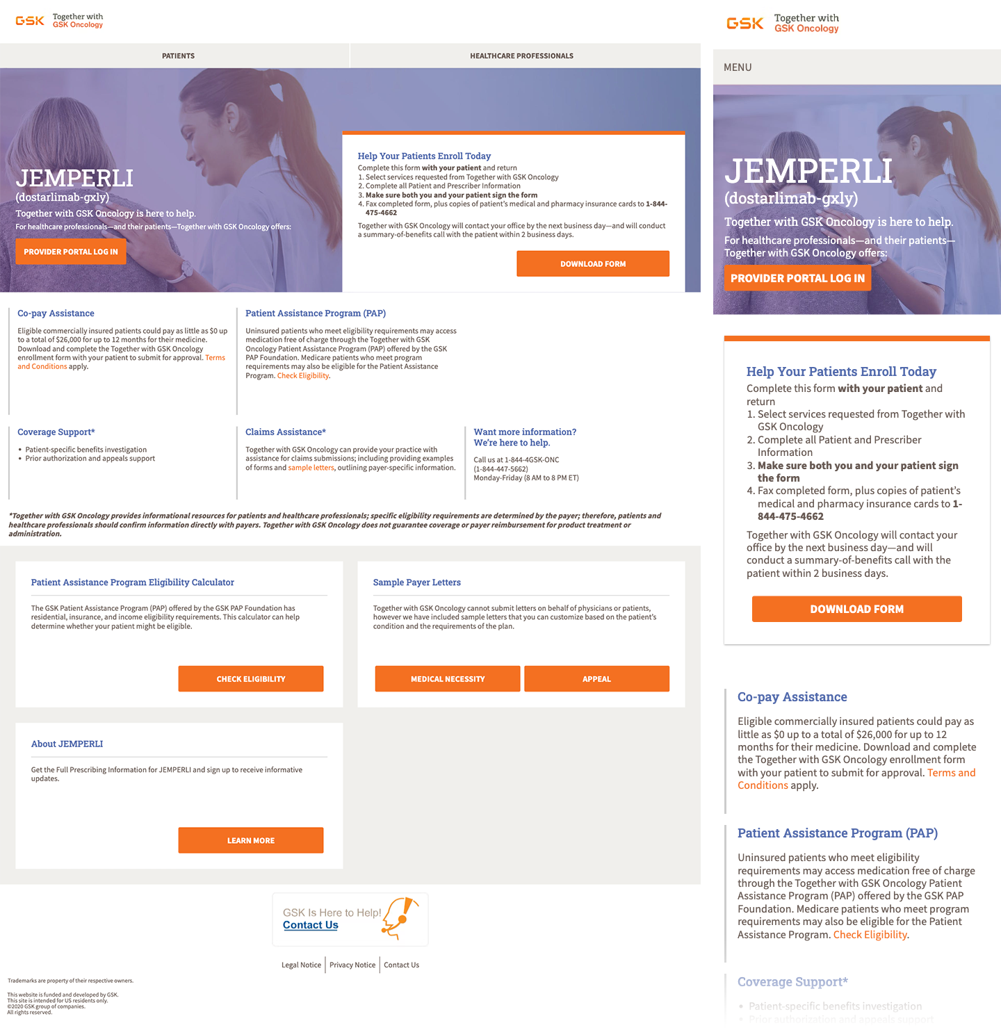
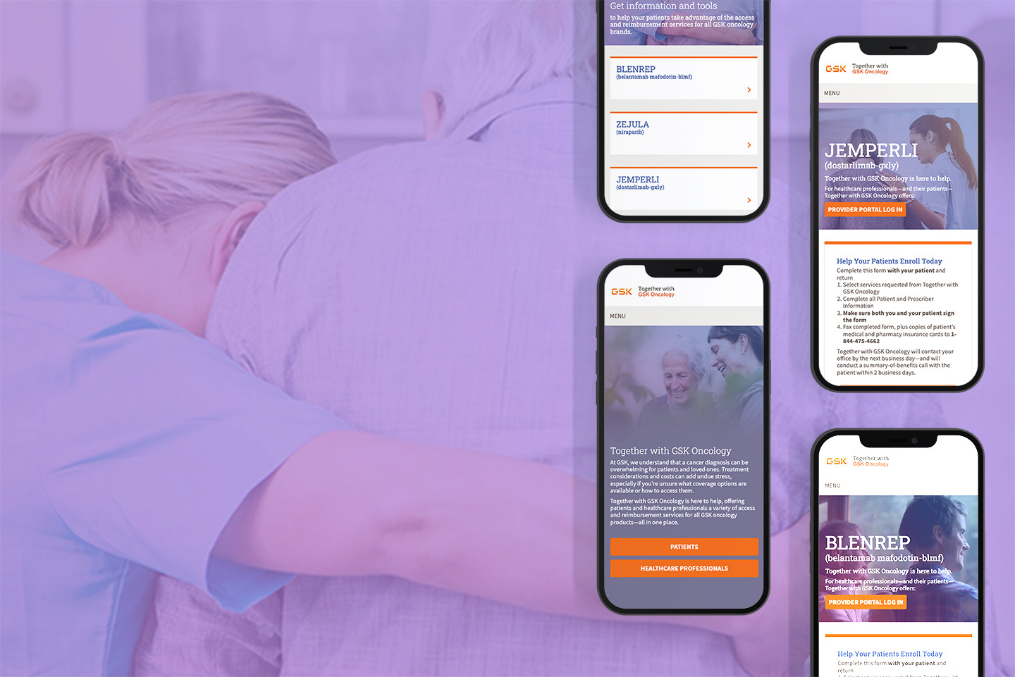
Help Your Patients Enroll Today
Complete the form with your patient and return it to begin services. A summary-of-benefits call follows within two business days.
A 3px orange top rule marks the primary card in a group. White field, generous padding, soft shadow.
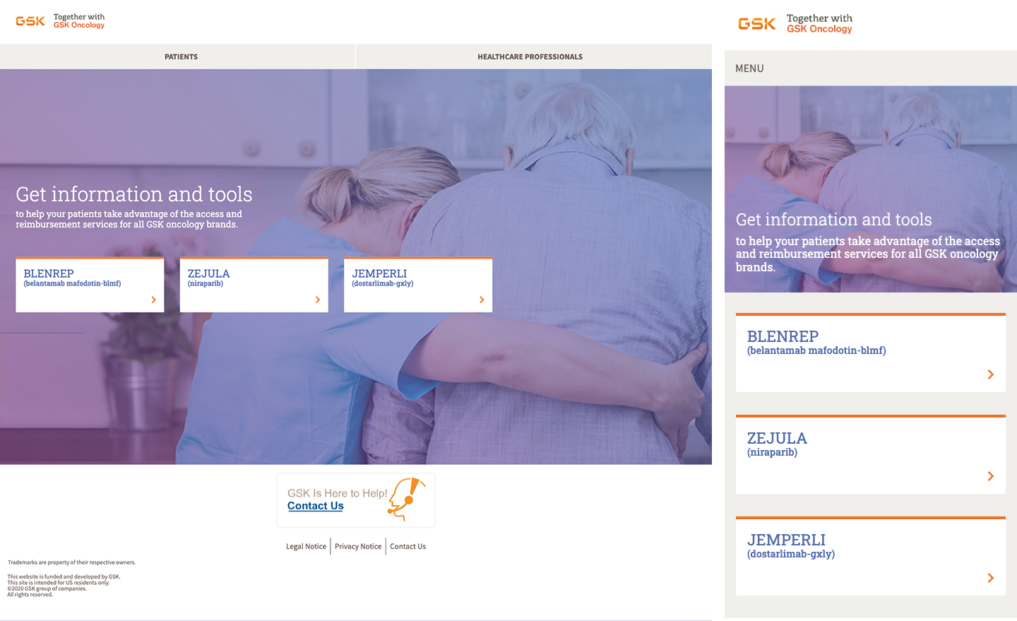
Product name in blue serif, generic name in gray beneath, orange chevron affordance right-aligned.
Co-pay Assistance
Eligible commercially insured patients could pay as little as $0. Terms and Conditions apply.
Content sections separated by thin gray rules; blue serif subheads, inline orange/blue links.
Two-way audience split anchors the top of the site. The active tab carries an orange underline.
Imagery
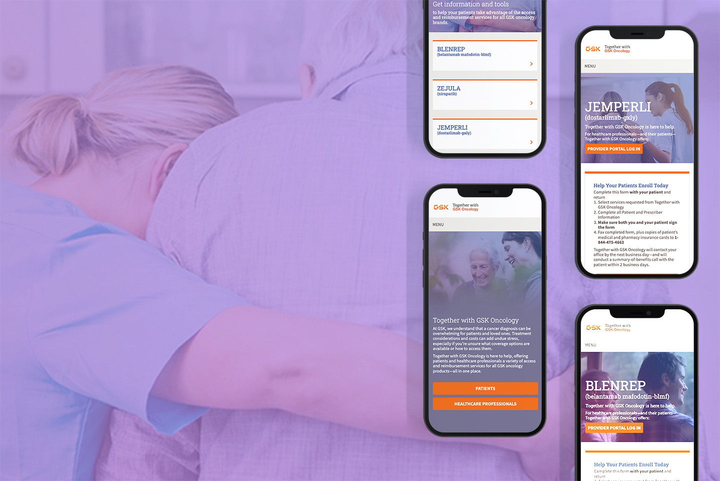
Genuine caregiver-and-patient moments — connection, reassurance, dignity. Candid over posed; no clinical coldness.
A violet-to-periwinkle gradient at ~50% opacity unifies all photography and lets white headlines sit legibly on top.
Headlines and buttons live over the darker left region of the frame. Keep faces clear of type.
Layout & Spacing
12-column grid, ~1080px max content width, centered. Two- and three-up card rows are the workhorse layouts.
8-point base: 8 / 16 / 24 / 32 / 48 / 64. Section padding runs 48–64px; card padding 24–32px.
Alternate white and warm-gray section backgrounds to give long pages rhythm and structure.
Near-square edges (0–3px). The brand reads crisp and clinical, never rounded or playful.
Logo bar and "Contact Us" help widget stay available across every page and breakpoint.
Voice & Tone
Supportive, plainspoken, and genuinely on the patient's side.
- Reassuring
- Clear and jargon-free
- Action-oriented
- Respectful of stress
- Cold clinical tone
- Overpromising outcomes
- Dense insurance-speak
- Fear-based framing
"Together with GSK Oncology is here to help." Lead with the person, name the next step, keep sentences short.
Design Screens
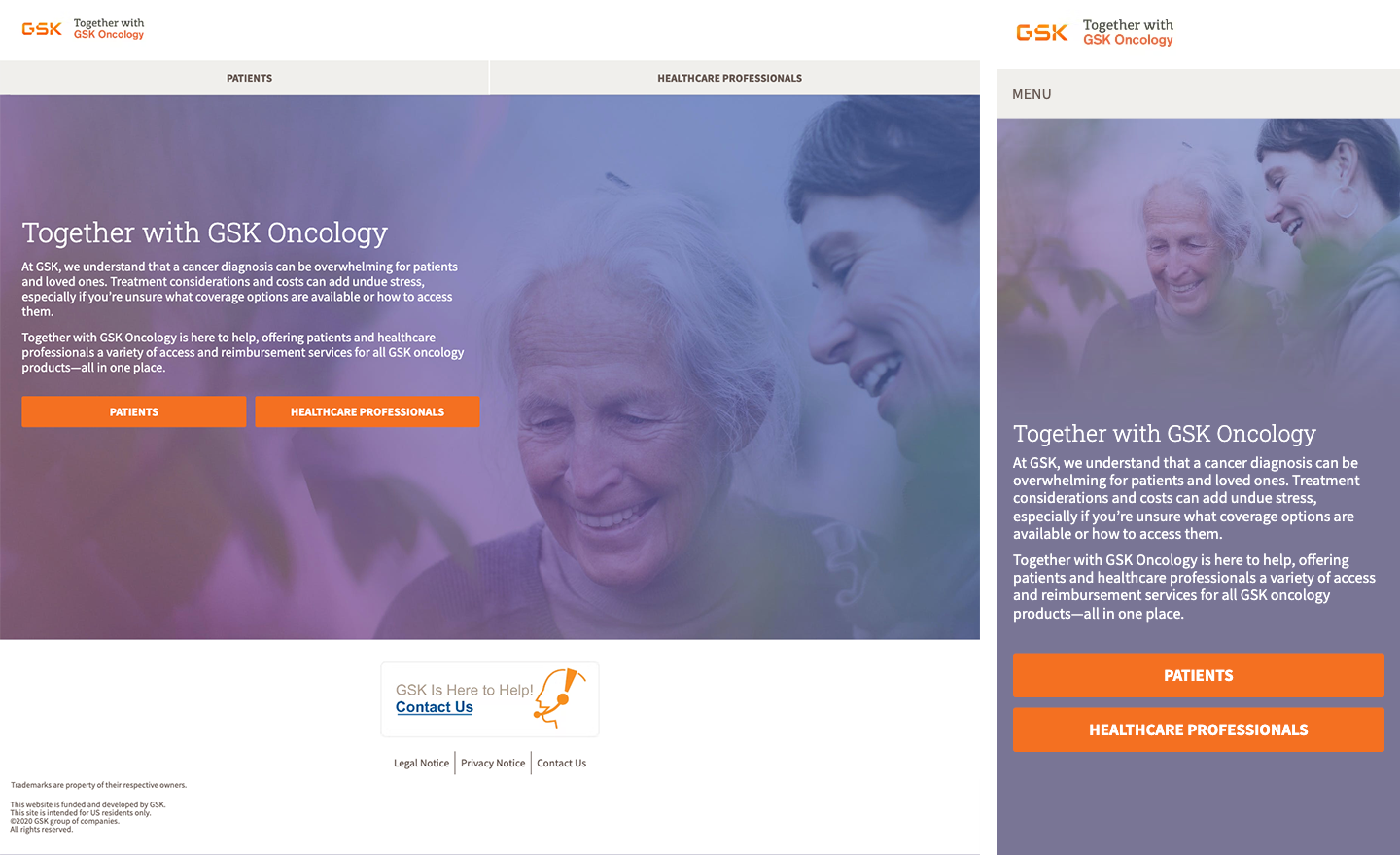
The system in production — the Together with GSK Oncology experience across the homepage, product selection and detail pages.