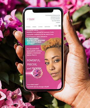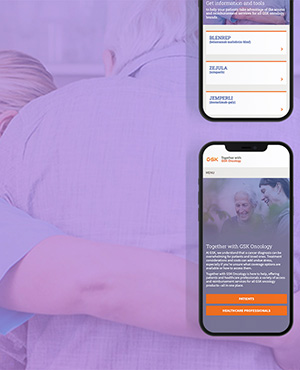
Allergan
Botox
UX/UI, Design, Digital & Technology
Clinical clarity, human warmth
The digital experience earns the trust of healthcare professionals. Every screen should feel precise and evidence-led, while the warm palette keeps it approachable rather than sterile.
Logo & wordmark
Always place the approved logo lockup from the brand asset library — never redraw or re-typeset it. The lockup pairs the wordmark with the generic identifier onabotulinumtoxinA.
Wordmark shown set in the brand typeface for placement reference. The official lockup includes a registered graphic device — use the supplied vector artwork.
Keep a margin equal to the cap-height of the wordmark on all sides. Nothing intrudes.
120 px wide on screen. Below this, legibility of the identifier is lost.
Recolor, rotate, stretch, add effects, or place on a busy photo without a scrim.
Color palette
One dominant orange does the identity work. Neutrals stay warm; gold is reserved for interactive markers. Aim for roughly 60% light neutral, 30% orange, 10% ink and accent.
Typography
A single humanist sans — Mulish — carries the whole interface, from heavy anatomical callouts to fine print. A monospace is used only for labels, specs, and metadata.
Core UI components
A small, consistent kit powers the interactive tool: injection-site markers, callout labels, caption cards, media controls, and slide navigation.
Gold rings pin sites on anatomy. Default, active, and dose-point states.
injection sites
White ExtraBold labels with a leader line, set over imagery.
Solid-orange card for procedural notes overlaid on a scene.
Circular play control and charcoal modal for procedure footage.
Thin outline arrows and a view label (Front / Side / Back).
Filmstrip of related sites; the active item carries an orange frame.
Imagery & photography
Two image families work together: precise 3D anatomical renders on warm neutral backgrounds, and real procedure photography. Both are lit warmly and kept clinically honest — no stylized filters.

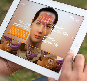
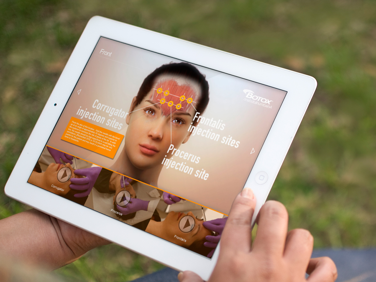

Keep skin tones natural, gloves clean, focus sharp on the injection site.
Add heavy color grades, orange tints, or dramatic vignettes to clinical photos.
Brand pattern
A fine radial line-burst is the signature motif. Use it large, cropped, and low-contrast — a texture behind headers, never a foreground graphic.
Layout & grid
Built landscape-first for tablet. A full-bleed stage holds the anatomy; a persistent title sits top-left, the logo top-right, navigation on the edges, and a media rail along the bottom.
8 px base scale · 16 / 24 / 40 rhythm.
8 px controls · 16 px cards · full for pills.
Persistent 16 px safe edge on the stage.
Motion & interaction
Motion is quiet and functional. It orients the user between views and confirms taps — it never performs.
Cross-fade / slide between Front, Side, Back at 300–400 ms, ease-in-out.
Gold rings fade and scale up in sequence to lead the eye across sites.
Controls dip to 96% scale on press; ~150 ms. Nothing bounces.
Charcoal scrim fades in; player scales from 98%. Dismiss reverses.
Voice & tone
Speak to clinicians as peers: direct, evidence-based, and unhurried. Reference literature where it earns trust; never overstate.
- Precise and instructional
- Calm and confident
- Respectful of the clinician’s expertise
- Grounded in evidence
- Salesy or hyperbolic
- Casual or jokey
- Vague about dosing or risk
- Alarmist
All product claims, dosing, and Important Safety Information (ISI) must be current and medical-legal (MLR) approved before publishing. ISI is always one tap away.