ZEJULA
Omnichannel
UX/UI, Digital, Technology, Art & Design
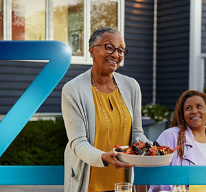
A steady hand and a clear path forward.
ZEJULA speaks to people navigating a difficult moment with warmth, clarity and momentum. Every touchpoint should feel human and reassuring — never clinical or cold — while keeping information easy to find and act on.
Momentum and hope. Language and visuals always point ahead.
Real people, real moments. Empathetic and personal in tone.
Plain words, generous space, one action at a time.
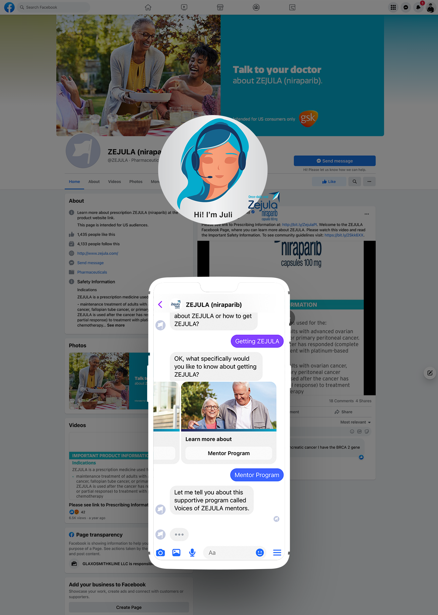
Beside the patient at every step, on their terms.
The wordmark & lockup
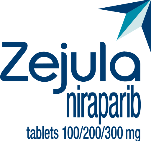
- Forward mark — the upward azure swoosh signalling progress
- Wordmark — rounded, humanist, set in navy ink
- Molecule — "niraparib" in sky blue
- Descriptors — "once-daily oral" & dosage
Keep free space equal to the height of the wordmark's cap-height on all sides. Never crowd with copy or imagery.
140 px wide on screen. Below this, drop the dosage descriptor for legibility.
Recolour, stretch, add shadows, or place the navy lockup on low-contrast photography.
Palette
Azure leads, navy grounds, and a warm coral–orange family adds human energy. Keep interfaces predominantly white with confident colour blocks.
Type system
A rounded, humanist sans that carries the brand's warmth. Set headings in 800–900 weight, tight tracking.
Neutral and highly legible for paragraphs, labels and long-form medical copy. Regular for body, bold for emphasis.
Building blocks
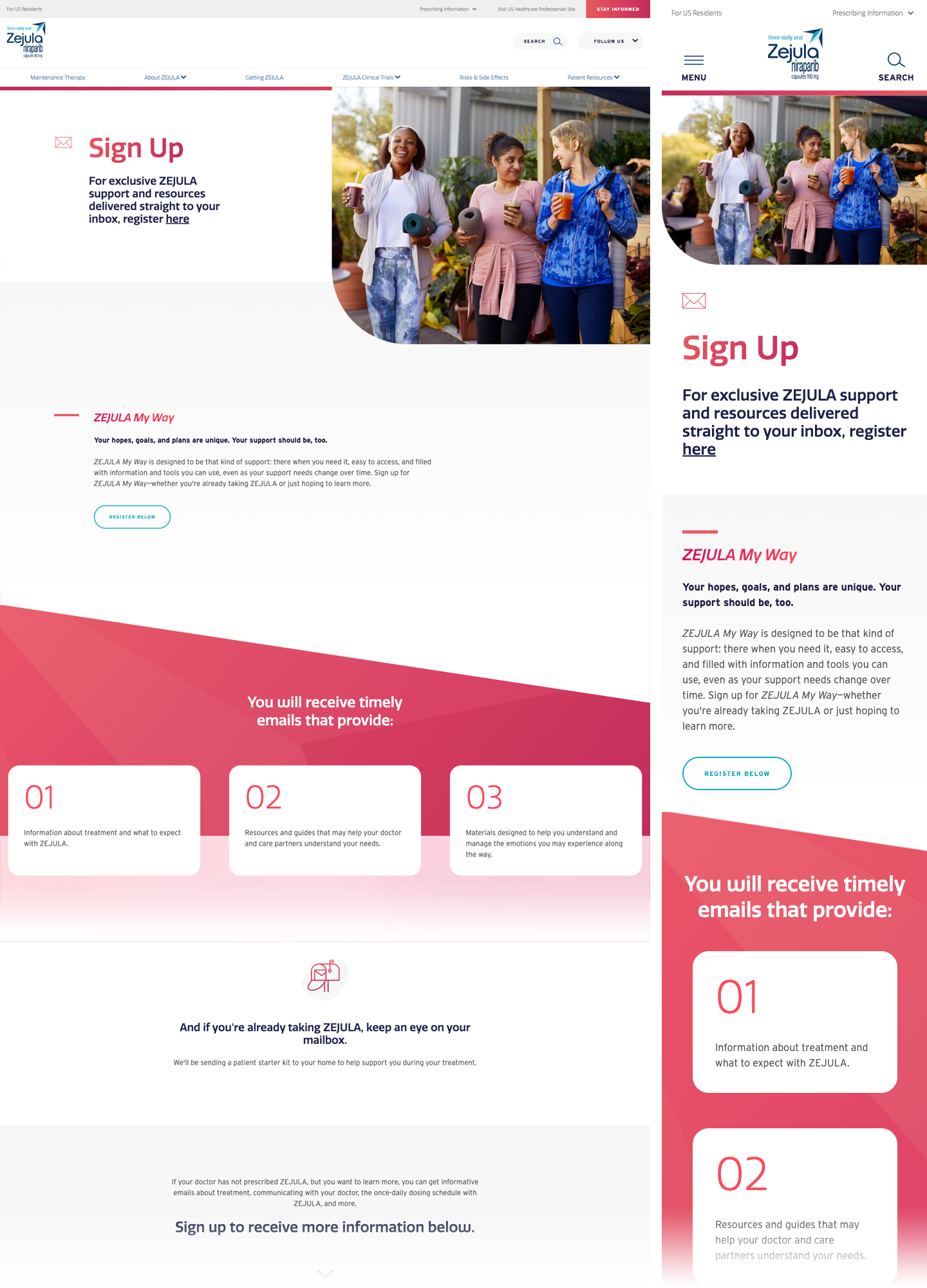
What to expect with treatment.
Resources for your care partners.
- Radius 16–18px on containers, 12px inside
- Shadow 0 12px 34px -22px rgba(30,42,87,.4)
- Generous 32–40px internal padding
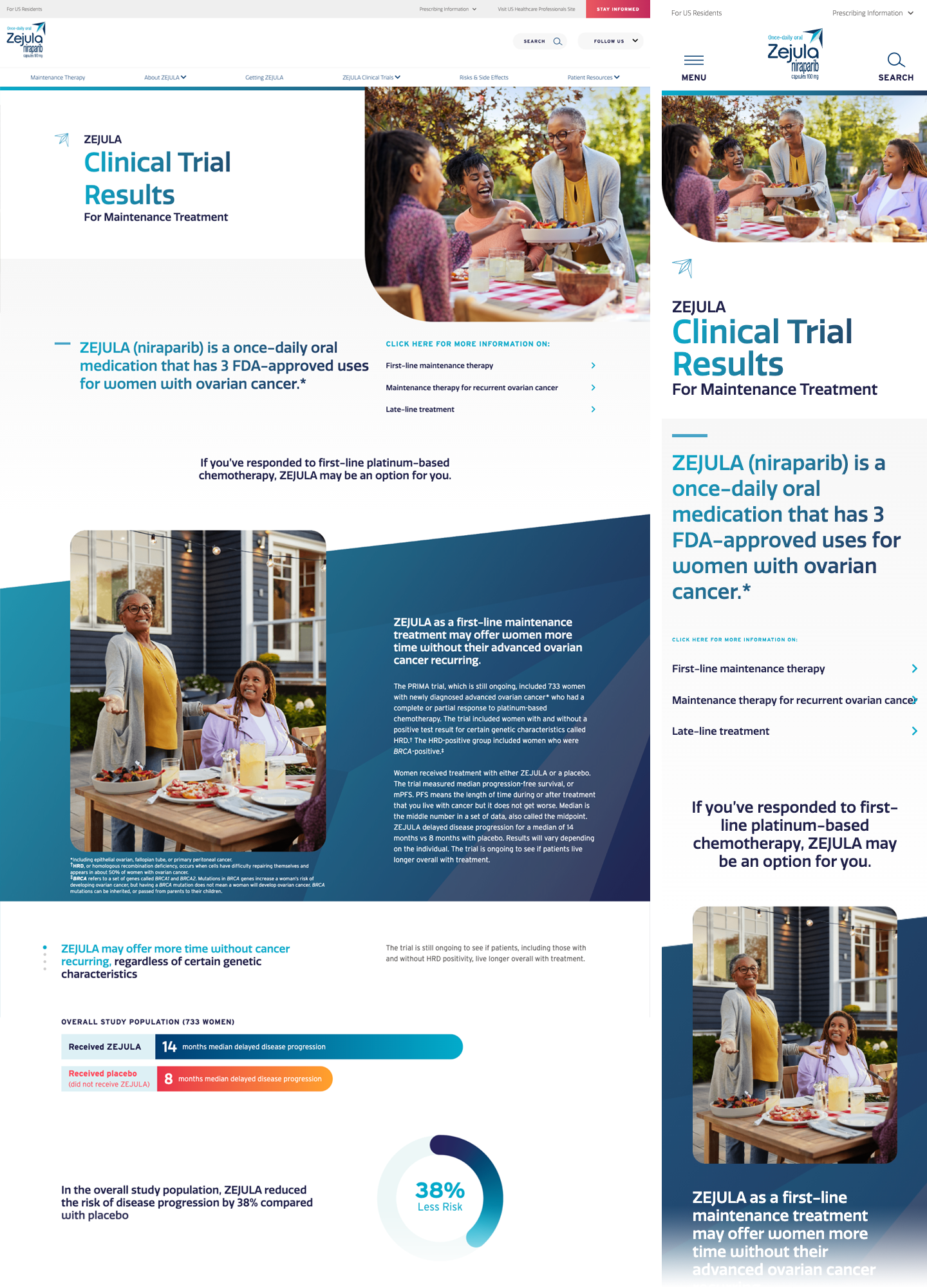
Bars use the primary gradient for the brand result and the warm gold gradient for comparison. Keep labels in pill chips.
Donut charts, azure on mist.
Photography style
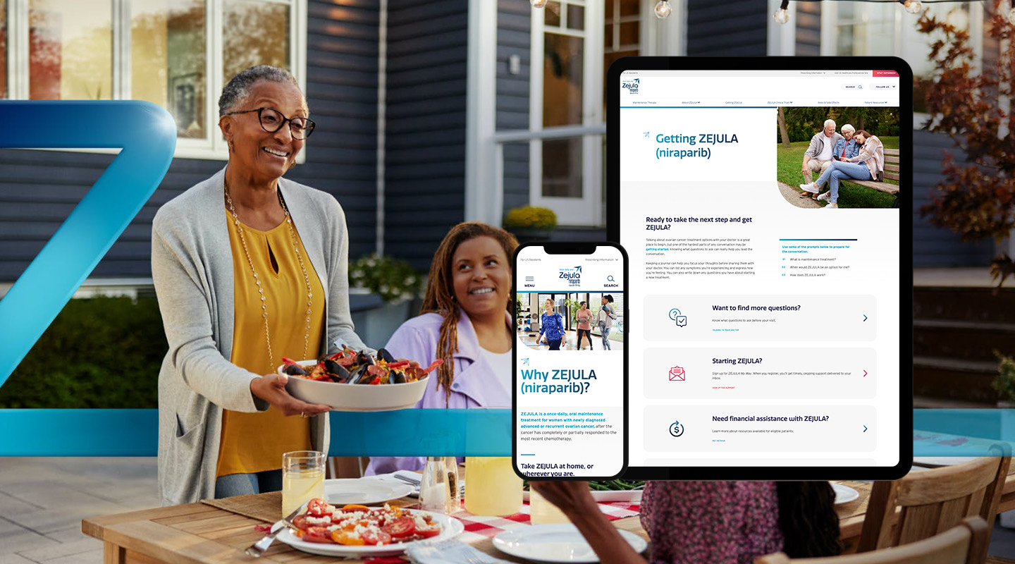
Candid, warmly-lit moments of real connection — shared meals, walks, everyday life. Natural light, authentic settings, genuine expressions. Never staged, clinical or stocky.
- Warm, natural daylight
- Real relationships & moments
- Diverse, age-appropriate casting
- Optimistic, forward-looking mood
- Clinical or hospital settings
- Posed, expressionless stock
- Cold or desaturated grading
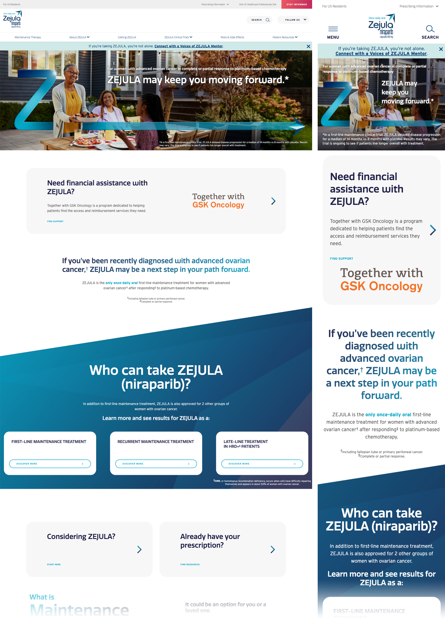
The system, applied
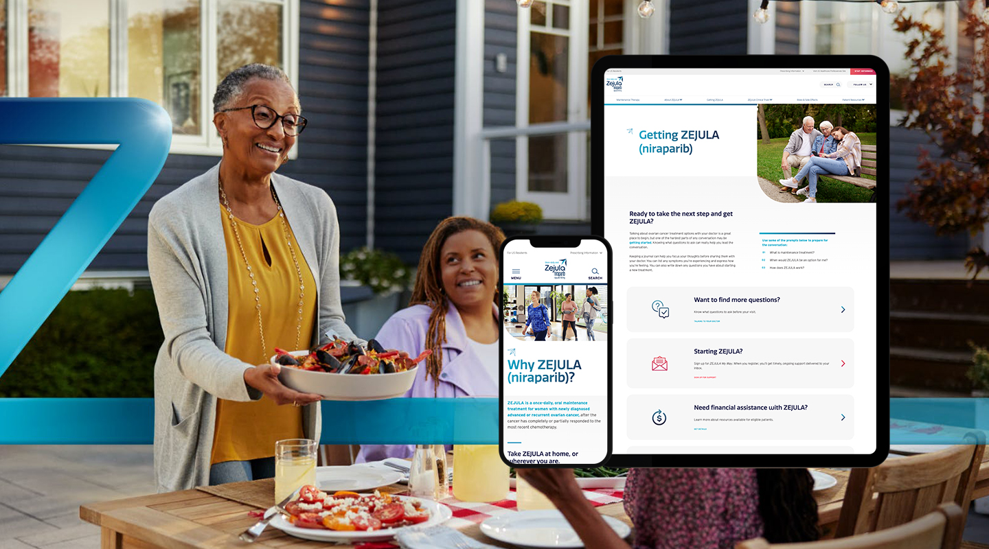
Responsive layouts hold a white base, generous rhythm and one clear action per block. Colour blocks and the forward mark punctuate; content stays scannable across desktop and mobile.
How we sound
Calm and steady. We meet people where they are without minimising their concerns.
Short sentences, everyday words. Medical terms are always explained.
Always a next step. We frame the road ahead with realistic hope.
"ZEJULA may keep you moving forward."
"A next step in your path forward."
Jargon-heavy, clinical statements.
Overpromising, fear-based or alarmist language.